meta name="p:domain_verify" content="c874e4ecbd59f91b5d5f901dc03e5f82"/>

Pages

Showing posts with label monoprint. Show all posts

Sunday, July 28, 2019

Going With Your Gut...

...is, I think, the only thing to do.  In life, as in art, come to think of it.  I got half way through stitching this, the first of the green  monoprints I made recently, and thought... it would be so much easier to machine stitch.


And there are several more in this series... it would be quick, easy... but, my gut said, it wouldn't be right.  And my gut, as usual, is correct.  Dammit.  Why?

There are a number of reasons.  Monoprints are the most painterly of prints.  They're very direct, as is hand stitch, each mark a deliberate choice.  Machine stitch is by no means as direct : the machine is between me and the work.  The machine controls the stitch, even when free machine embroidering.  That's not what is needed here.  In addition, the direct contact with the piece is needed: it means I can see and contemplate, moment by moment, what I do next, where to put the needle, what size to make the stitch, which stitch to use.  Machine stitch doesn't afford the same luxury, the same choices.  Machine stitch also creates a far flatter, straighter line, no spaces, less easy to control...one unintended nudge or shake of your hand will knock it off course... you get my drift.  No pun intended.

Going with my gut is usually inconvenient, frequently challenging...but always right.  Now to get on with the work.  Possibly with a little muttering under my breath about how unfair it all is...


Saturday, July 27, 2019

Done.

So...the piece I showed you last time is finished, and here it is.


It's on top of more of the same orange coloured lutradur, to strengthen the background colour.  I think it's fairly effective.  The cardboard disc is a yellower colour than it shows here, and I like the way the stitch has worked out.  I had intended to add more stitch to the background, but I've decided against it; I think it would distract from the piece, rather than add to it.   I've trimmed it down, to give it some balance, and it'll sit happily in a mount. 

I've been drawing today, faces, probably the only thing I don't often share on the blog.  Of all my work, it's the most personal, though, given some of the work I've shown over the years, that may surprise you.  It has been a long time since I drew a person, and I'm reminded how important it is to keep practicing.  It's not bad, you understand...but...  Some other time, perhaps. 

Now I need to cut some batting, before I can start stitching the monoprints, and a couple of the larger pieces I've been working on recently.  I've been too tired to paint, the last couple of days, but I think I can muster the energy to do that...if not today, then certainly tomorrow.

Thursday, July 25, 2019

A Timely Reminder

Facebook has its uses.  Today, it reminded me of the original photograph that the manipulated image came from, the one I used as the basis for a painting here.  And it seemed only fair to use it as the basis for another painting (as you do).


I started with a sketch.  I've gradually accepting that sketching is the best thing to do in these circumstances: it lets you become familiar with what's going on in your source material.


So far, so boring.  Decided that I'd started too far along, so the line down the far right is a reminder that I need to pay attention to the balance.  What I ended up drawing on the paper as the basis for the painting, looks slightly different.


More of an interpretation, here, transferring what I learned from the sketch, onto the paper.  And here's the end result.


I like the rich paint on the far right, and the textures... lots of stuff going on.  Not at all what I'd planned...but then, it never is.    Not sure if this is the 'right' way up...


There's more movement, this way up: did try it the other way round, but it's very, very static that way, don't like it as much.  Decisions, decisions...

And then there's the obligatory monoprint...gotta use up that paint...


I like this one.  It's on paper: the ghost print is on Evolon.


Looking forward to stitching this one...but I like them both, probably more than the painting... which I suspect tells me something.


Wednesday, July 24, 2019

On A Roll...

...with the monoprint thing... it's getting interesting.  I started with a painting, and then took two monoprints from it, one on cloth, one on prepainted paper.  I suspect the painting isn't quite finished...but I'll need to wait and see. 


And then I thought... use the rest of the paint... and play with greens.  These photographs aren't terribly accurate in terms of colour; apparently my camera doesn't like green... but they're an approximation.  They get looser as I go on, and the paint gets less.


All four are on cloth : the first is on transfer dyed lutradur, just for interest's sake, really.  I don't think every one of these is successful...but I won't know until I've added stitch.  And if they're not, it's okay.  This is about process, not about result.  What I am pleased about, though, is that these feel like mine.  They don't refer to anything or anyone, and whilst I have no idea at present what this is 'about', I have the feeling they'll tell me.  This is my preferred way of working: no idea, no picture in my head that I have to somehow follow, just me, the cloth and the paint.  And that's how I like it.  Now to see if I can find some thread...


Saturday, June 29, 2019

Yes, another one.

Monoprint, that is.  There are, as always, two of them...


I'm working with the ghost print. I was planning to have them in this orientation, and I was struck by the interesting variations in colour on the ghost.  That would be because I tend to work layer on layer on the glass plate I use, so as the thicker layer is removed, the remains of whatever was on there before tends to come through.  It's lazy, perhaps, but also serendipitous. 

I looked for threads that would pick up all those variations in colour, and got started.  The circular motif has been stitched in a spiral.


It made me think of fossils, of which we have a small collection.  And it struck me that that circular motif looked as if it was embedded in the lower section, which gave the piece its name.  By this time, I'd trimmed the piece down quite a bit, to get rid of the excess white, and the blob of colour at the bottom, which was a distraction.  And I stitched some more.  And then I thought, that white... it doesn't look right... and the orientation's not right, either.  So this is what I ended up with.


The grey at the top is a mixture of black, white and silver, though, given it's watered down, you don't notice the metallic element of the paint.  I had intended leaving the grey area unstitched, but it didn't seem right, unbalanced, given the amount of stitch in the lower two thirds of the piece.  And that seemed to solve another issue : I had felt that the circular motif didn't have enough stitch in it, but couldn't really see how to fix that.  Miraculously, adding stitch to the grey resolved the balance enough for me to feel better about it. 

So...Embedded it is.  I'm planning to machine stitch it's 'twin', so watch this space ...

Sunday, June 23, 2019

Unintentional

...well, it was.  I was working on a completely different piece, when I was left with a long bit of red/orange thread, too long to discard.  So I went to work on a second piece, and found myself finishing it almost before I knew what I was doing. 


Yes, it's another monoprint, much looser than the work I've been showing you.  It didn't originally have the red circle, but it needed something, and that seemed to be what it needed.  The stitch is a lot looser, too, mostly straight stitch but with some cross stitch at top and bottom.  Once again, I've stitched in order to support the brush strokes of the paint, for the most part.  And I've only used one colour of thread....couldn't be simpler.

It strikes me that all these pieces are connected by this idea of simplicity, of paring everything down, not adding more than is absolutely necessary.  I initially intended to add stitch to that red circle, but decided that it simply didn't need it; it's a strong enough mark to stand as it is, without cluttering it up with stitch. 

The actual piece is a bit wider than I'm showing you here.  It was my intention to crop it, but I haven't yet cut anything.  Which is just as well, because I have the feeling that I need to include a bit more on that right side.  The bottom mark continues along into white space, with no stitch.  It gives the piece an airiness, a sense of space, that this image doesn't give.  So I've learned something today.  Less is only more when it works.

And now I need to go back to the first piece I was working on, but that will have to wait til tomorrow.


Friday, June 21, 2019

An (Almost) Matching Pair...

...of landscapes, made from a monoprint and a ghost print.  I talked about the ghost here.  This is the main print...


I'm popping the ghost print down here, for easy comparison. 


There's lots more texture in the main monoprint, much easier to see what's happening in the main body of the 'land',  It's clear that there are a lot of curving lines, so the stitch reflects that.  I like using blanket stitch, it encloses and defines areas of space in a much better way than a running or back stitch is able to.  I did use the same thread in these areas on both quilts, but the sky in this main piece reads as much darker than the ghost print, unsurprisingly, so I used a darker thread in the sky.  The treatment, though, is the same, seed stitches scattered around the blue areas.  I did consider adding linear stitch, but decided that it would distract from what was going on below it, and I didn't want to do that.

So, there you are...two nearly identical landscapes.  It's interesting how different the stitch makes them appear, though it's clear that they are related.  I've got a couple more monoprints in this palette to work on, and it will be interesting to see how they turn out in comparison with these.


Sunday, June 16, 2019

More Simplicity...

is sometimes the only option.  Take a look at this...


The eye reads it as a landscape...and the stitch supports it, small and narrow at the back, wider and larger at the front, to give a dimensional effect, and some random stitching in the 'sky'.  I had intended to add some applique, to suggest a standing stone, but actually...it's fine as it is.  I did try the applique, and that was fine, too, but different...and I prefer this version, so here it is.

And you may remember, I cut a piece of cloth in half, here, and created a landscape with it.  I struggled with the second half of the cloth...and in the end, added an orange circle, to give it a focal point....and struggled some more.  In the end, I took some blue thread, and stitched it randomly...


It's a landscape too, I think: a very different type of landscape, much more abstract, no apparent horizon line...but nonetheless...  The dark marks are closer to a dark turquoise than you see them here, but this was the best I could manage, so... I'm still not sure about it, but the stitch has improved it, somewhat.  In this, the actions I've taken are simple, the piece itself, less so.  But I rather like it, nevertheless.  Who says simple has to be the same every time?

Friday, June 14, 2019

Not Worth Having?

At one level, that sums up  the hour or so I spent monoprinting, this morning.  Here's what I produced.


All on paper, which had been worked on a couple of days before, except the last one, which is on a scrap of pale green sheeting.  Three of them probably merit further work, but the other two  will be painted over, or binned. 

So, why am I telling you this?  Well, because whilst they may all end up in the bin, they were nonetheless worth doing.  I've said it before, I'll probably say it again: it's the process that matters, not the end result.  In this case, I've learned a few things.  For one, I need to be more careful about how I handle the paint on the plate, because, whilst I want to produce texture, I don't want to produce blobs.  Secondly, I really do need to either use printing inks, or remember to use retarder with the acrylics, because on warm days, the damn stuff dries far too quickly for my liking.  Finally....I'm not entirely sure I like working on paper.  That last one's a biggie.  I much prefer the process of adding paint to cloth, to then add stitch of one type or another.  Though that might be because I don't feel I have the skill level with paper, that I do with cloth.  Of course, the only way to increase my skill with paper, is to keep doing it. 

Lots of people give up at the very beginning, because they can't tolerate the feelings that learning produces in them; they're not comfortable.  Sticking in one's comfort zone is a huge temptation.  I know a lot about paint, but clearly, I don't know enough, or else I've forgotten what I knew, because I'm really not happy with these, and I don't like it.  It would be easier to give up, to be honest, to stick to what I'm fairly good at, working with cloth.  And I might consider using cloth as if it were paper, it's not unheard of, after all, though it's normally canvas that people use, and given the amount of fabric for dyeing I have, I'm not buying canvas to add to the pile. 

Lots to think about.  And that fourth one's heading for the bin.


Thursday, June 13, 2019

Harvest.


Another monoprint on sheeting... small, about 5.5" by 7.5".  Yes, you guessed it, excess paint again.  When I started stitching, I had intended to stress the verticals, but realised that doing so would take the emphasis away from the logical focal point, that orange circle.  So... lots of seed stitches in orange, and the addition of some long, straight stitches emanating from the circle.  Somehow, that wasn't enough, so I added some chain stitch in the centre...which still wasn't enough.

So...I took a pencil, and drew over the edges of the circle, just to help it to stand out from the background....and I was tempted to leave it at that.... except...it looked a tad bland.  So... some blanket stitch across the diagonal line in the lower part of the piece, and some long stitches to show up the verticals but not so much that they took over.  And it still wasn't done.

Some time ago, I mentioned on FB that I wanted to stitch in gold on a piece of silk, and a friend offered me some gold threads, which she kindly sent me.  I never did stitch the silk...but here's the thread, or some of it, on that central orange blob.  Is it a sun?  Is it a flower head?  Is it something else entirely?  I don't mind, really.  All of them, or none of them.  Either way, the piece is now as done as it's going to be.  I have a few more monoprints in this palette to play with.  And, having used it on this piece, I think I need to learn a bit about goldwork.... but that's for another time.

Friday, June 07, 2019

Finishing Off...

the small piece on muslin I showed you yesterday.  And I do mean small : it's just over postcard size.  I trimmed it back a little more once I'd finished the stitching.  While there are still areas of white on the edges, I'll be adding a mount, which will cover them.  The colours are reminiscent of Highland hillsides, and I'm fairly pleased with it.


So now what?  Well... this was the 'ghost' of another monoprint.  This one is much more definite, has a good deal more colour, and is slightly bigger, roughly 8" square, though that includes a fair amount of white space around the edges...probably closer to 7" square, if that were trimmed away. 


You can see the similarities in structure; there's a clear flow down from that top left hand area, through the blue to the bottom right.  The movement inherent in the paint is much clearer, though, just by dint of there being more paint, and the colour is stronger, all round.  Were I not about to do a fair amount of machine quilting on a different project, I might be tempted to machine stitch it...and I still might.  I do think I'd like to get rid of some of that white, as I did in the first one.  This time, though, I think I'll add some more paint, rather than putting cloth between the top and the batting.  I'll do that, I think, and then make a decision as to how to stitch. 


Wednesday, June 05, 2019

Spontaneity...

...often leads to interesting work.  I've been playing about with painting fabric, after the success of the Dance piece, and when I'd run out of steam, there was still some paint left.  When in doubt...monoprint... so I grabbed some scraps of fabric.  I got several interesting pieces, one of which I worked up yesterday.


This is how it started.  It made me think of rocks, mountainsides, hillsides... so its name is 'Red Rock'.  So, I popped a bit of batting on the back, and hand stitched...and this is what it has ended up as.


I started at the bottom, stitching with variegated thread to give a reference to landscape (I hope), and then back stitched the red curve in the centre. I didn't want to add vast amounts of stitch, so took my queue from the dots of red that cover that area, and made some small, irregular stitches, just enough to suggest the colour.   Then, blanket stitch in the dominant brown curve, shortening the stitches as I went along to suggest distance.  And finally, I added washes of pale blue and pink watercolour paint, to tone down the white areas that were dominating the piece. 

And that's it.  I did contemplate more stitch in those paler sections, which almost make a V shape in the left hand side of the piece.  Finally, though, I decided that the texture of the paint itself did enough to suggest movement, and let it be, though I did add a few pencil marks to the edges of the diagonal section, just to emphasise it slightly.  And that's it.  I'm quite pleased, all in all, not bad for using up excess paint.

Tuesday, October 09, 2018

Meanwhile...

...another of the pieces I kept out of the cull.  This is a piece of evolon, and it has been transfer dyed; that, I know for sure...the rest is speculation.  I think this is a monoprint.  I'm persisting because I love the textures in some of the areas, mostly the left hand section.


I was finding it difficult to decide which way is up, hence the two images.  The jury is still out, but I'm going to work with the top image, and see where we go. 
 
I've argued with myself, long and hard, about whether to work with this.  The main problem I have is the dark section, which seems to dominate the piece.  In the bottom image, it looks a bit like a semi abstract figure running away (bizarre, huh?). 

So, I need some way to redress the balance, and decided that a continuous line of stitch along the textured section would help to define it.  I happened to have some appropriate thread, but the question was, which stitch?  I feel quite lazy when it comes to stitch, so I decided to use one I haven't used before, split stitch.  Basically, it's a back stitch, but instead of meeting the edge of the preceding stitch, you come out within it, splitting the thread.  Here's a close up...


Reader, it's fiddly.  It's not helped by the evolon, which is not easy to hand stitch.  The best advice I can give, if you want to try it, is to keep the thread taut by catching it underneath, before bringing the needle upwards.  That makes it easier to trap the thread.  It drove me nuts....though I suspect it would have been easier, had it not been evolon....sigh... 

It may have been fiddly, but it worked.  The balance has shifted from that purple morass in the centre, out to the edge, as I hoped it would.


Now to decide what to do next. 

Tuesday, September 18, 2018

Yes, I Know...

...I did wax lyrical about building time into the process...but...   I looked carefully at the book, and realised that, actually, there's a theme already there... it's about curves.  The brain is a wonderful thing; it insists on finding meaning in seemingly random marks.  It's a tendency I'm profoundly grateful for.  To my intense surprise (I'd love to say it was planned, but it so wasn't...), each of the spreads created by combining the three monoprints in book form, seems to create a new coherent whole, with a flow from one side of the page to the other.  Have a look, see what I mean.  Each of the spreads comprises one side that is the reverse of a print, and one right side of the next print (if you see what I mean), with the exception of the centre spread, where both sides are the reverse of the print.  Come to think of it, I could have turned one of the prints round, so that I got the print side showing as the spread, but actually, I think this way is best.

Spread One:


The first spread is quite intriguing (okay, I find them all intriguing, what can I say, I'm an artist, it's what we do...).  This one has two curves, which seem to echo each other, but they do meet in the middle...can you see it?  Interestingly, if you placed the original prints together, they look quite different, but combined in this way, they seem similar to some degree. 

Spread two:


To me, this reads almost like a semi-abstract snail, or a strange beast of burden...but you can see the curve running from the top of the 'head' to the base of the 'shell'. 
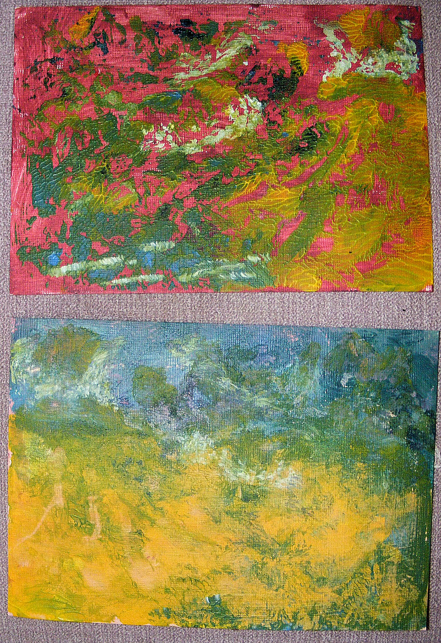
Spread three:


Here, you can see how different the reverse of a print really is.  This, to me, looks similar to a ghost print, the second print that you take from a monoprint.  The stitches on the left hand side have a really random feel; I like the sense of space that I get from it...this time, the strong curve shown by the dark stitches then continues on and upwards, over the egg-like shape on the second page. 

Spread four :


Here, the dark curve above what appears, on this side, to be more circular than ovular, continues on into the lighter area, sitting inside a second curved shape suggested by the print.  The straight lines of that dark curve on the left are echoed by the lighter, longer lines in that curved shape on the second page. 

Spread five :


This is the most visually incoherent of the spreads, but there is still a suggestion of a curve, in two places, though one is not as obvious in the image as it is in real life.  The first of those curves sits where the pages meet, the lines stitched into the beige coloured area on the left, meet the curves stitched into the lower brown area on the right.  More abstractly, though, the upward  movement of  that beige area continues until it meets the brown semicircular area at the centre top of the opposite page.   Interestingly, this is the only other spread in the book where the stitch appears more abstract in places.  I think that idea of stitch on one side not matching the stitch of the other side, is something I'd like to explore. 

So, there you are.  One finished book, other than the stitch to bind it.  I think its name is Curvilinear.  Interestingly, I've already made a quilt with that name, a long time ago, admittedly...the two are not particularly similar; you'll find it here, in a post entitled 'Creative Surprises'.  Not unlike this book, really.


Wednesday, September 12, 2018

Sew...

...more stitch on the book I'm currently working on.  Here's the progress.  I've finished the front page now...I think... I'm never entirely sure until the whole thing is done...


You're going to have to imagine it folded, admittedly...but this is both sides.  I'm intrigued by the reverse, because, of course, the stitches don't look the same on the back, as on the front, so things get a bit more abstract (or should that be random?).  So...that's the front and back of the book (as well as both sides of the paper, if you see what I mean)....now here's the central pages.


The central motif is stitched with a rayon hand dyed, corded thread (the rest are cotton), which proved a pain to work with, but its sheen goes nicely with the metallic paint that was used.  As this isn't a colouring book (and don't get me started on the point of colouring books, or lack of it...), I didn't feel the need to continue the stitch so that it filled the entire motif.  I decided I wanted to have large vertical stitches on the bottom dark section.  Blanket stitch, I thought.  Ha ha ha, said my memory.  I know you've done it lots of times, but I don't remember how you did it... ME affects memory, and a lot of what I used to know, doesn't come to mind easily.  In this case, I could remember how the stitch works, but not how to start it.  Got there in the end, though, by process of logic.  Just as well that hasn't gone, too...

I did briefly think about swapping the front and central pages round, but decided not to...they've been trimmed to fit the way they are, swapping them round would require a further trimming, and I want to avoid that.  Given that no real narrative for the book has yet emerged, it wouldn't have affected the flow or meaning of the book.  That's unusual for me; usually there's a story, a meaning, a sense of how things relate to each other, that requires a particular structure, even when the work is largely abstract.  I think that's why I'm drawing a blank on writing a poem to go inside the book.  Perhaps something will emerge...that often happens with titles and concepts.  I start with one thing, and end up with that thing, but also with other meanings and ideas.  That's what I like about making art.  I'm not following a pattern or a template; each piece is unique.

Monday, September 10, 2018

Stitch Up.

I felt like doing a bit of stitch, so decided to do a bit more with the second of the two monoprint books I talked about here.  I started by trimming it carefully (and that took all the energy for a while...).


And because of that, I decided to hand stitch.  I have no proof that it takes more energy to machine sew...but it does when the machine isn't set up... sigh.  And in truth, I wanted to see how the hand stitch would work.  I think it does...but it does come with its own issues.

We are taught from the very first stitch, that the back should look as good as the front.  That's fairly easy to do when working with a quilt sandwich, just by burying the knot in the batting.  This, though, is flat, so it's an exposed knot or a double back stitch.  Reader, I went for the double back stitch.  So far so good, huh?   I stitched all the way round the shape (have a look)...only to (stupidly) catch said double back stitch with my needle, and pull half of it out.  No, I really wasn't up for unpicking, so thought, okay, I'll catch the end with the stitch I'm making... and then the paper tore...sigh...and I ended up, yes, you guessed it, with a knot, albeit a small knot, which you wouldn't notice unless you knew were it was.  No, I'm not telling you...and yes, I continued with small knots... they're not particularly noticeable either... fortunately.


The temptation is to work the page as a whole, and that, I felt was necessary for the main motif, that curve, which runs over the fold of the paper.  On reflection, though, I decided that, other than stitching any single motif that occurred in that manner, I needed to respond to each individual half as a separate piece of work. 

The stitch is important, not just because of its effect on the 'front' page, but because of its effect on the reverse.  The reverse has only the bleed from the front, which clearly is not as strong, so the stitch is important in delineating what's going on in the image.  Here's an image showing you how that worked out...I think it's at least as interesting as the reverse, if not more so, in some ways.


I wanted to add some stitches above the main motif, and added crosses to the yellow area which I seem to be reading as the sky.  Another of the rules we're taught right at the beginning, is that all stitches have to be even and similar.  Fortunately, however, this is art, and I can use the skills I learned then, to subvert the tradition. 

And that's as far as I've got.  Time for a rest. 


Monday, July 23, 2018

Today's Blog...

...is brought to you from the sofa.  Robin's out, and we're expecting a couple of parcels.  Doubtless they'll arrive once he's back again. but if not, by the time I get downstairs, there's a real risk that the delivery man will have disappeared again.  So here I am.  It's more difficult to rest on the sofa; too much stuff that ought to be done, or wants to be made.  I'm resisting.  That said, I'm also contemplating this piece, which you'll remember from Saturday's blog on printing.  It said it wanted to be a book: I agreed.


It looks quite different in 3D, than it did lain flat...


The orientation change makes a huge difference, while the folds encourage us to read both the whole thing and the individual page.  I did contemplate hand stitch, but I really do think that machine stitch is preferable (really do have to ring the engineer this week, I NEED my machine back). 

And talking of needs, the piece needs a poem.  Of course it does, I hear you holler.  The poem will be written on the other side of the book, this time, before the stitch is added.  I think the effect of the stitch will be interesting; it should break up the text, even the individual letters, making the poem act like a piece of visual art.  Which is, I suppose, the whole idea. 

The poem is about interpreting visual marks.  I've got a thing about that...I talk about it here, to some extent.  I stitch, print and paint in this way, making marks, and to me, that reflects the natural world, where the elements create marks in and on, for example, stone, which our minds then attempt to interpret.  'Natural Graffiti', a quilt I donated to a cancer charity, reflects that them (see it here), but I've been stitching rune-like and other abstract and semi abstract forms into quilts since I started making, over thirty years ago (cough).

No, it's not written yet; I'm going to lie on the sofa for the rest of the morning, and see what we can come up with, my unconscious and me.  Seems infinitely reasonable.