meta name="p:domain_verify" content="c874e4ecbd59f91b5d5f901dc03e5f82"/>

Pages

Friday, August 30, 2019

Pairs...

...are interesting, as they give you the opportunity to explore, to see what would happen if, to interpret differently.  These pieces aren't exactly a pair: they're monoprints (yes, again), and as such, one is fainter than the other, and as a result, the pieces have a different feel to them.  That, in turn, invites a different approach.  So...


The overall structure of them suggests an island, to me at least, with a reflection of sorts in swirling water.  In both pieces, I've tried to suit the stitch to the marks of the paint.  The original print, on the left, has significantly more marks then the ghost print, and, as a result, I've added only enough stitch to support the directional movement of the paint.  The exception to that is the island, which is stitched using random marks.  I haven't stitched the 'sky' at all in this variant; there didn't seem to be a need.

There's a lot more happening, stitch wise, in the ghost print, because of that lack of definition.  It reminded me, somehow, of the Impressionist approach.  There's a lot of light in the second piece, more so than the first.  I wanted to support the idea of movement, but I also wanted to stitch the whole piece.  The 'island' section is stitched in a random way, but with larger stitches than the first piece, while the 'reflection' is stitched in the same way, using even larger stitches.  The rest of the piece is stitched using a sort of exploded herringbone stitch, creating a patterning of sorts, but without the crossover that characterises herringbone.  I'm sure there's a proper name for that, but I'm equally sure I don't know what it is. I wanted something to suggest movement, but without too much structure. 

Two pieces, same structure, completely different approaches and feels to them.  Interestingly, I find I like them both.  Which do you prefer?

Wednesday, August 21, 2019

Unexpected Choices...

...are always interesting, and usually the best.  I'm mid relapse, and whilst  lying in bed, was leafing through an art book... and had an idea.  Perhaps unsurprisingly, it was a book about Sean Scully, and the idea was to do with this particular structure.  Yes, it needs to be ironed... sigh. 


The colours in this aren't all that accurate, but you get the drift...  Left to right, there's a section of rust dyed lutradur, one of tea and onion skin dyed cotton, and rust dyed muslin.  Two of the three are semi transparent, and that proved to be quite important. 

I'm not that keen on this, mostly, I suspect, because I hate white, and rarely use it in anything at all, textile or painting, other than to mix in with other paints.  I love colour...and apparently have a problem with the absence of colour.  The original idea I had, was to add some colour, a square, thereof, in the lower right section, which is quite different to the original idea, to stitch with the thread you see there, browns and blues, following the curves in the rust dyed sections, and across the white.  When I went into the studio to select the fabric, though, I spotted the box with the lace. 

I don't use lace, much, but I have some for hats.  Somehow, though, it seemed like a good idea to use something lacy on top of these semi transparent fabrics, following through on that idea.  When I opened the box, I spotted a doily.  Now, I don't like doilies.  I had a brief moment when I thought I'd use them in work, as is the fashion...but it has never really seemed like my kind of thing.  I really don't like this whole, take something, or better still, lots of things vintage and slap it/them onto a background and call it art, trend that has been hanging around for at least a decade, if not more.  Circles, though.... I liked the idea of circles.  So I fished around in the box some more.  And then I had a rest (as you do...well, as I do, these days). 

And this is what I'm going with.

   
Three doilies, all featuring lace and/or cutwork.  The one on the right is positioned on a circle of lutradur, to echo the lutradur element of  the base fabric.  And I've fished out some very pale threads to stitch them down with.  That, though, is for another day : I've overdone it.  But it has been worth it, I think... much better than sitting gazing at a computer screen. 

Tuesday, August 13, 2019

That's Better...

...though you may not see the difference.  My sister kindly gave me some water based oil paints, some time ago, having heard me talk about them.  I finally tried them out.  I hadn't realised quite how big a difference there is between acrylics and oils, but this confirmed it.

Reader, I painted.


Boxed In I and II...and there's a lot to explore in this, for me, at least.  It's how I feel about ME: locked into a tiny space, unable to move much, or do a great deal.  The observant quilters among you might notice a resemblance to a log cabin block in the structure of the painting...that was certainly going through my mind as I was painting. 

I've never used water soluble oils before, so I tried monoprinting.  Okay, maybe not.  Each of these was made on paper that had been underpainted in acrylic.  The first one then had additional marks added, the other two were left as they were.  Don't think I'll be doing that again, though.  Not fussed about the red one, but rather like the other two, especially the second one.


The upside...I love painting with oil paint, it's thick, buttery, easy to work with, and this watercolour version is incredibly easy to clean up.  The downside, though, other than the oil smell, is the length of time they take to dry.  This is day three, and we're still not quite there...I don't really have enough room to have work lying around drying for days on end.  So the jury's out on what to do about it.  I suppose the simplest thing would be to stop painting, but I get a good deal of pleasure from it.  So I think I'm going to reserve judgement, and perhaps play with some more of my toys...I have both printing inks and a lot of pastels, soft and oil.  Maybe there's something I can do that will be easier to do and not take as much energy.  I'll let you know.


Monday, August 12, 2019

When In Doubt...

...change it.  In this case, crop it hard.  I made a collage, several, actually, and spoke about one of them here.  I said I wouldn't keep it... and I haven't, at least, not in its original form.  I found some card blanks lying around, and thought... okay... 


And here's the end result.  This was the original piece


I basically looked for the interesting areas, cut those first, and then took whatever else I could see worked in the little aperture of the card.  I've got some small bits and pieces left, including the circular piece, which just looked daft in the aperture.  I think I could have tweaked it, but frankly, a. life's too short and b. I didn't have enough cards. 

I like them in this incarnation...and hopefully the recipients will like them too, when they eventually get sent.  Must eventually get some more card blanks... some time after the expenditure freeze... in the meantime, I'll put aside anything I think will work.  Although given how expensive greeting cards are these days, I reckon this is a pretty cost effective way of doing it.  Green, too...


Friday, August 02, 2019

Process, Process, Process...

...oh, and learning.  The two most important things in my practice...and possibly, not giving up.  I bought some canvas boards to paint on some time ago, and they've been waiting for me to be brave enough to use one.  Today was the day.  I approached it the same way as I've approached the smaller works, and decided to use a table easel.  I bought one several years ago, when I first got ME, thinking that I'd be unable to stand long enough to paint, so... The jury is out.  I couldn't work on the board vertically, because it hurt my arms to do so.  Fine, I turned the board round.  And then, having applied the paint, I thought....that's awful.  So, given it was lunchtime, I stopped painting and had intended to leave it for a while...like a day or so... well, that didn't happen.  I went back into the studio to have a look at it and thought...it really is awful.  So, rather than binning it, which was tempting, I thought about what it was that was wrong with it.  Reader, I was trying too hard.  Instead of relaxing and letting things happen, I let my head get in the way, constantly thinking, instead of just going with the flow.  Structure wasn't right, either. The result?  Flat painting, no movement, too dark... you get the drift... but at least I knew what to do about it.

I should have taken a photo at that point, but I didn't.... so here's one about half way through redoing the green section.  It's not obvious from this, but I've extended that section significantly, and lightened things up... more interesting brush strokes, giving a bit of movement... sorry, lousy image, light behind the canvas isn't helpful, but it was the only place I could put it. 

 You can see the difference in tone and movement between the area I've worked on and that lower left hand, darker section... not quite chalk and cheese but... And then I worked on that middle section...


I'm still not convinced, but it's an improvement to some extent...the real thing looks better than the image.  And that's as far as I can go, until I can get some more paint: I've run out of the darker blues I want to incorporate in this, so no more for now.  What is particularly interesting, though, is that I'm not particularly enjoying working with acrylics.  When I started painting, some twenty years or so ago, I worked with acrylics, but switched to oils on the suggestion of my painting mentor.   Apparently it has ruined me for acrylics altogether, except for working on fabric, and possibly monoprinting.  Fortunately, I've been given some water based oils to try, so I'll make a couple of smaller pieces and see how I get on with them. 

I don't think this is going to be a piece I hang on my wall...or even keep...but I'm learning a great deal from it.  I suspect I'll paint over it, it's still not working for me.  Pieces like this can be discouraging if you let them.  It helps if you bear in mind that subsequent pieces will be improved by the learning you get from the process.  And at least I can paint over it until I'm happy.


Thursday, August 01, 2019

Sharing...

...what I know, is one of my favourite things to do.  I miss running workshops, and coaching people, more than almost everything else.  I had a visitor yesterday, and took her into the studio to see the paintings and monoprints I've been making recently.  And when she asked how I made the paintings, it seemed easiest to show her, rather than try to explain.   And these two pieces were the end result, a painting, and a monoprint taken from the painting.


The paint was quite thin, so the guidelines in the top piece are clearly visible.  I'm not actually sure that that's a bad thing.  They're both interesting, in different ways.  My friend left, determined to try it for herself, which is a good thing.  The more people making art, the better, after all. 

I told her, during the session, that the thing to do was to trust oneself, and trust the paint ( I should have said, trust the process, but hey...).  And interestingly, when going through some old journals, looking for some notes I made for a possible book (didn't find 'em), I found this.  'There is something about just letting the paint be paint... that it will ultimately be part of a landscape is irrelevant.  Work it as it needs to be worked and it will come together eventually, and you will have what you will have.'.  Which is really what I was trying to say.  At least I'm consistent: that must have been written at least ten years ago.  It works for fabric, too. 

Wednesday, July 31, 2019

Sewing...

...isn't always a solitary activity.  Cara has been with us for a couple of days (you've met her before; she has a reputation for creativity...), and wanted to make a cat.  Okay.  So we went through the process... making a pattern (based on Mooncat, who you can see here), cutting it out, choosing the fabric (took a while, that one), pinning it on (working out the difference between pins and needles), cutting it out, stitching and then stuffing. 


Had I thought about it, I'd have enlarged the pattern, or drawn one from scratch, but Care's really quite happy with the end result, and that's the main thing.  She did really well for a five year old, paid attention the whole way through, and stuffed with aplomb.  The acid test, of course, will be if she wants to repeat the process.  We had fun, though, and that's the main thing.  How long til we progress to doll's clothes, I wonder...? 


Sunday, July 28, 2019

Going With Your Gut...

...is, I think, the only thing to do.  In life, as in art, come to think of it.  I got half way through stitching this, the first of the green  monoprints I made recently, and thought... it would be so much easier to machine stitch.


And there are several more in this series... it would be quick, easy... but, my gut said, it wouldn't be right.  And my gut, as usual, is correct.  Dammit.  Why?

There are a number of reasons.  Monoprints are the most painterly of prints.  They're very direct, as is hand stitch, each mark a deliberate choice.  Machine stitch is by no means as direct : the machine is between me and the work.  The machine controls the stitch, even when free machine embroidering.  That's not what is needed here.  In addition, the direct contact with the piece is needed: it means I can see and contemplate, moment by moment, what I do next, where to put the needle, what size to make the stitch, which stitch to use.  Machine stitch doesn't afford the same luxury, the same choices.  Machine stitch also creates a far flatter, straighter line, no spaces, less easy to control...one unintended nudge or shake of your hand will knock it off course... you get my drift.  No pun intended.

Going with my gut is usually inconvenient, frequently challenging...but always right.  Now to get on with the work.  Possibly with a little muttering under my breath about how unfair it all is...


Saturday, July 27, 2019

Done.

So...the piece I showed you last time is finished, and here it is.


It's on top of more of the same orange coloured lutradur, to strengthen the background colour.  I think it's fairly effective.  The cardboard disc is a yellower colour than it shows here, and I like the way the stitch has worked out.  I had intended to add more stitch to the background, but I've decided against it; I think it would distract from the piece, rather than add to it.   I've trimmed it down, to give it some balance, and it'll sit happily in a mount. 

I've been drawing today, faces, probably the only thing I don't often share on the blog.  Of all my work, it's the most personal, though, given some of the work I've shown over the years, that may surprise you.  It has been a long time since I drew a person, and I'm reminded how important it is to keep practicing.  It's not bad, you understand...but...  Some other time, perhaps. 

Now I need to cut some batting, before I can start stitching the monoprints, and a couple of the larger pieces I've been working on recently.  I've been too tired to paint, the last couple of days, but I think I can muster the energy to do that...if not today, then certainly tomorrow.

Friday, July 26, 2019

Too Tired...

...to paint, so I thought I'd look at the monoprints.  First, some time spent on hunting up threads to go on a group of monoprints...so far so good...


That pale yellow looks odd in the ball, and might not be used on the top print, but it works nicely at a single strand on some of the paler versions.  So then on to stitching the lutradur monoprint...


Long stitches, reflecting the movement of the paint.  The problem with stitch at this size is that it has a tendency to pull the fabric, no matter how careful you are, so I'll probably fuse this piece to a backing, for preference something with colour in it, which will reinforce the gold colours in the background due to the semitransparent nature of the lutradur.    Again, so far, so good.  Except that I didn't seem to have found quite the right shade of green (most of what's reading as blue in this image is closer to green), so I went through to the studio to see if I could find anything suitable( (so much for sitting still)/  And there was the thought that I could perhaps find something to put in that upper left hand section, a piece of fabric perhaps, in a ring shape.

I don't often use embellishments, which is rich from someone with a substantial bead collection... but I did want to find something to use here, to break up the movement of all that green, mostly, as it seemed very dominant.  And I found a white box, but I couldn't remember what was in it... Jackpot!  Not only did it have thread, it had some embellishments, too, which I could vaguely remember intending to use on a different piece, some time ago (don't ask me which: clearly it never happened). 

One of those embellishments was this button :


Right size, lovely texture but wrong colour, though I did love the striations running through it.  A bit more hunting found me this...


Odd, isn't it?  It's a cardboard circle which I suspect came out of the lid of a jar of something.  It has a blue mark that refers quite nicely to the background, and it's the right shape.  Reader, I glued it on.  I intend to stitch over it with more large scale stitches, a bit like shisha gone mad.  I may not use the  suitable green thread after all... the thread I used on the right hand side will be perfect. 

And that's the state of play so far.  It's not the best thing I've ever made, but it's not bad, either.  And it does go to show that I do keep some very strange things in my boxes.  Strange, but useful. 


Thursday, July 25, 2019

A Timely Reminder

Facebook has its uses.  Today, it reminded me of the original photograph that the manipulated image came from, the one I used as the basis for a painting here.  And it seemed only fair to use it as the basis for another painting (as you do).


I started with a sketch.  I've gradually accepting that sketching is the best thing to do in these circumstances: it lets you become familiar with what's going on in your source material.


So far, so boring.  Decided that I'd started too far along, so the line down the far right is a reminder that I need to pay attention to the balance.  What I ended up drawing on the paper as the basis for the painting, looks slightly different.


More of an interpretation, here, transferring what I learned from the sketch, onto the paper.  And here's the end result.


I like the rich paint on the far right, and the textures... lots of stuff going on.  Not at all what I'd planned...but then, it never is.    Not sure if this is the 'right' way up...


There's more movement, this way up: did try it the other way round, but it's very, very static that way, don't like it as much.  Decisions, decisions...

And then there's the obligatory monoprint...gotta use up that paint...


I like this one.  It's on paper: the ghost print is on Evolon.


Looking forward to stitching this one...but I like them both, probably more than the painting... which I suspect tells me something.


Wednesday, July 24, 2019

On A Roll...

...with the monoprint thing... it's getting interesting.  I started with a painting, and then took two monoprints from it, one on cloth, one on prepainted paper.  I suspect the painting isn't quite finished...but I'll need to wait and see. 


And then I thought... use the rest of the paint... and play with greens.  These photographs aren't terribly accurate in terms of colour; apparently my camera doesn't like green... but they're an approximation.  They get looser as I go on, and the paint gets less.


All four are on cloth : the first is on transfer dyed lutradur, just for interest's sake, really.  I don't think every one of these is successful...but I won't know until I've added stitch.  And if they're not, it's okay.  This is about process, not about result.  What I am pleased about, though, is that these feel like mine.  They don't refer to anything or anyone, and whilst I have no idea at present what this is 'about', I have the feeling they'll tell me.  This is my preferred way of working: no idea, no picture in my head that I have to somehow follow, just me, the cloth and the paint.  And that's how I like it.  Now to see if I can find some thread...


Tuesday, July 23, 2019

Oops...

...I did it again... apparently cutting things down a bit, wasn't enough.  I need a timer, so that I stop before I get overtired...oh well...  You can see for yourself if it was worth it...

I started, and ended, with monoprints.  My friend Alison encouraged me to make more beach inspired stitched pieces, so I made some basic monoprints for that, on a piece of pale green sheeting...


They'll make half a dozen small pieces...so far so good.  Not particularly wanting to work in those colours, I wiped off the palette... and was so intrigued by the marks that wiping produced, I monoprinted again, this time on a bit of Evolon that happened to be lying around. 


Now this is intriguing, and I'm looking forward to adding stitch, and perhaps a bit of applique... we'll see.  I've always avoided putting paint on Evolon: the hand of the fabric is a big part of its charm, and paint interferes with that.  This, though, is well watered down acrylic paint, and although you can feel it on the fabric, it's not a huge change, so I'm pleased on that score, too. 

And then, because it was lying around, I added a bit more to this small piece, which I actually made last time, but didn't show you.  More monoprinting, to add small bits of colour and texture.


Not sure that it's finished... it'll sit in the studio until it is.  And then I moved to The Main Attraction... another painting on the same basis as those I showed you last time.  Complete change of palette, which makes a big difference...


A landscape feel... not sure that I like it as much as the last one, perhaps because it's moodier.  I can see some things I'll probably change in it when I go back to it...which is a good thing, because it suggests it's not irredeemable.  However, as I was finishing up, I decided I'd added too much paint (yes, it does happen), so took (yes, you've guessed it) A Monoprint from it, to add texture and remove some of the paint.  Look what I got...


I LOVE this.  Texture, colour, movement... it's got it all.  Much more my kind of thing than the actual painting, which feels really heavy by comparison.  I think I'll be doing a good deal more of this, on fabric as well as paper: I think this would be a great base for stitch.  Accidental breakthroughs are the best kind.


Sunday, July 21, 2019

Painting

I've been trying to get back into painting for some time, but a whole range of mental blocks and self criticism was stopping me, not to mention the thought that I might not have enough energy to do so.  I've been sneaking up on it, though...bought some canvas boards, got a wee bit of paint for my birthday... and the final kick up the pants was a conversation with my friend Alison, who said all the things that I would have said to someone in that situation... and I thought, sod it, why not? 

The real block is about representational drawing and painting, so I thought I'd warm up a bit with some abstracts, my comfort zone.  I usually start with nothing, other than a blank canvas or sheet of paper.  That's not always the best way to go, however, particularly if your inner critic is perched on your shoulder, giein' it laldy, so... Since I'm guilty of taking hundreds (literally) of source photographs, sometimes playing with them on PSP, and then doing nothing with them,  I leafed through my images and found this one. 


It was a photograph of a bench, believe it or not, or a part of a bench, the seat,  made from a beautiful piece of natural wood.  As you can see, I played with the colour and contrast quite considerably, but if you look carefully, you can still see the grain and a few cracks in the wood.  As a painter, I'm not interested in making a copy of what I see : that's what photography is for.  \(Come to think of it, that's probably part of my block with representational painting...but that's another story altogether).  There are lots of different ways to use a photograph as a source: I meant to write a book about it (should I?), but thought I'd just combine a couple of them.  One is to pick up the colours in the image, and combine them in a different way, and the other is to look at the underlying structure of the image, and use that as the basis of a new work. 

There's a lot going on in this particular image, so I simplified it quite considerably.  I don't usually draw as the basis of a painting, but it seemed like a good idea, so...


The lines basically delineate three main sections in the image, with a bit more detail.  I used the lines as guidance, not gospel, and ended up with this...


As you can see, I've changed the orientation.  If you compare it to the original piece, it uses several of the colours intrinsic to it, but not in the same balance.  The lines have disappeared, though if you look carefully, it does still divide into three main sections.  I can see there's a lot I would rework, if it had been on board, but I probably won't on this, because it's on paper, which doesn't support layer on layer of paint terribly well.  It's fine as a first attempt, though, and I think it will be worth making a version on board, eventually.  I'll probably make another few sketches on paper first, though, just to see where it goes. 

I took things one stage further on another, smaller piece of paper.  Again, it started with lines :


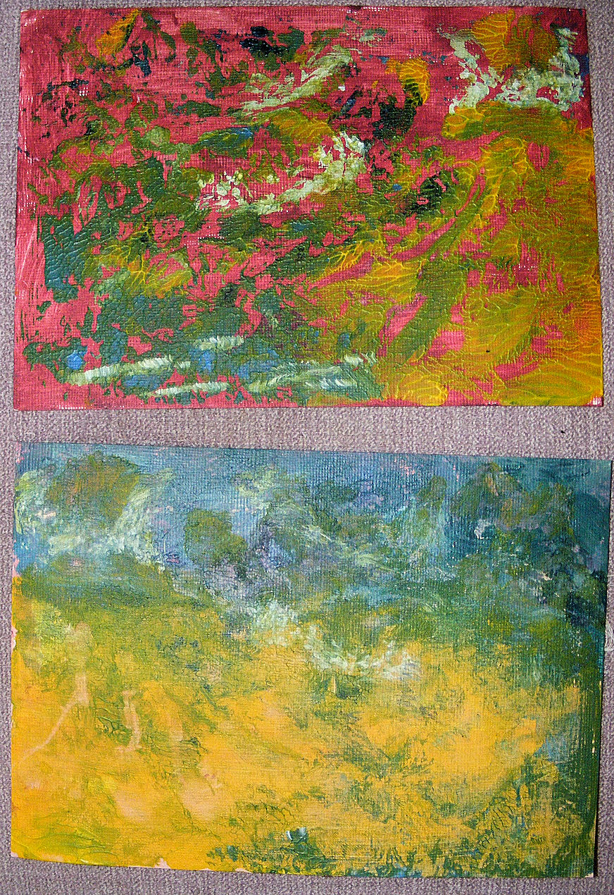
No real resemblance to the image this time, just the basic idea of curved lines, and a using up of the paint from the first piece.   And here's how it ended up...


Different palette, this time, to some extent, but similar approach.  And, as before, I prefer the other orientation...

Thinking about it, this refers back to the grain lines in the wood.  Overall, I'm really pleased with these pieces, they're a good start.  I've remembered how much I enjoy painting, and why I prefer oils (though I'll probably stick with acrylics).  I'll definitely take this forward...but not today... I've used up all my energy... knowing when to stop is A Good Thing.

Wednesday, July 17, 2019

Continuing...

...with the quilts made from the original inspiration of  Scully's paintings.  I rarely ever mark a stitch line, but I made an exception for this piece.


You can just see the marks, here, made using a Conte pencil that happened to be the right colour.  I wanted flowing, unstilted lines, and felt that drawing them, first, would make them easier to stitch.  I was right, as it happened.  Plus, any kind of drawing is good for one. So, I stitched.


And yes, it was fine, but it didn't feel right.  I didn't really want to add more stitch, though I did contemplate whipping the existing running stitch, to get a harder line.  Somehow, though, that didn't seem right.  I liked the feeling of space that the relatively limited stitch was giving, but I couldn't see a story, a meaning behind the piece.  Until I turned it over.


And somehow, it made more sense.  That seemed to suggest a real flow, from the top of the quilt, down to the bottom.  It felt like a white river, somehow.  Positioning it in this way felt somewhat counter intuitive.  It is constructed the way you would expect a landscape would be; top level, one third, bottom level, two thirds, giving a 'horizon line'. Turning it over reverses that ratio, and it feels a bit odd.  I think, though, that the flow of movement through the quilt stops the viewer seeing the piece as a landscape, and I think in part it was that line, that construction, that was getting in the way of seeing the meaning.  So this is how it will stay... it's called 'Outpouring'.


Friday, July 12, 2019

Back To The Books...

...at least for a moment.  I had cut a few 'pages' from an accordion book, made from Lutradur XL, and because they were lying around, and a bit battered, decided to experiment on them.  So I started by giving them a coat of acrylic paint, and then stitched into them to suggest a landscape.


Not the most exciting thing you'll ever see, but a good basis for continuing.  It had been a long time since I'd machine stitched on paint, so wanted to check that this wash wasn't going to give me any problems (and it didn't).  I had intended to add more acrylic paint in each section, a mixture of colours and marks progressing down the page, with a slightly different set of colours on each page, to suggest changing weather and/or times of day.  When I got round to actually doing something with it, though, there happened to be some watercolour crayons on the table.  I wonder....I thought... and this is what happened...


I like these strong blocks of colour, though I suspect they suggest different seasons, rather than times of day.  I was quite surprised by how well the watercolour sat on the fabric, though I suspect the acrylic underpainting was the cause of that.  I was even more surprised when I turned over to work on the other side...


The colour had bled through two layers of underpainting (one on either side), and  I think they work really well.  This side has a completely different feel to the reverse, and I'm pleased.  There were a couple of sections where the paint hadn't migrated, but a bit more water on the reverse side sorted that out.  I'd like to add some text, but the words haven't suggested themselves, so we'll just have to wait until they do.