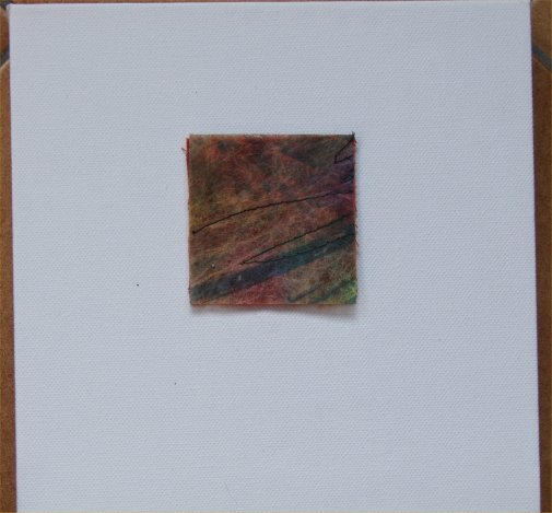
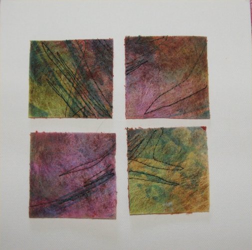
Vernon asks good questions. Yesterday, he asked about the small embroidery piece I showed yesterday, 'I'm wondering why it became necessary to reduce it down to the bare minimum when repetition is one of the most effective design tools?' He's right, of course; repetition is effective, and it's one of the cornerstones of textile art, especially piecing and quilting. So I thought I'd try to answer his question, and I've put both pictures up side by side today, to let you compare.
When I started writing this, I thought the answer was simple. It was, I thought, a question of space. The canvasses are small, 8" square, the embroideries, 2.5" square. Putting four small squares on a small canvas felt somewhat squashed up, to me. A single square works better.
Or perhaps, a bigger canvas would look better.
And then I realised that that wasn't the whole truth. It is also a matter of where the viewer focusses the attention. In the four square piece, what pulls the eye, I think, is the flow of colour over the four squares, the way some colours and stitch move one way, and others, another. We look at the four, as if they were one. In the single piece, the eye has nowhere to go but the interior of that one embroidery. It is still; there is no movement outwith the edges of the piece. It is quiet, contemplative. I prefer it, though I still like the other piece...and will go buy a larger square canvas, next week, to see if that works better. It may not.
I think this is a wonderful example of working in reverse. I'd love to say that I consciously worked all this out, but it's quite obvious that I didn't. My unconscious was busy, designing, whilst the rest of me thought I was playing with some offcuts. At the end of the day, who cares...the end result is there, to be enjoyed. Which one do you prefer?
7 comments:
to be honewt, I like them both. ,G. I DID NOT MEAN TO OFFEND. i did not know the peidces were so small, hough I doubt that would hae chaned my feedbac. I REAL8IZE NOW THA IT APPEARED THT i WAS QUESTGIONING YOU DESIGN, FAR BE IT FROM THE TRUTH. THE UNCONSCIOUSS KNOWS FAR MOE ABOUGT DESIGN THAN i WILL EVERF KNOW AND MY CRITIQUE WAW OFFERED IN GOOD FAITH.
Seeing them together, I do prefer the single. No competition, no distraction. The repetition could come if they were all mounted the same way and displayed together.
I like them both but the simplicity of the single piece is appealing.
Just to be awkward Marion, I love the 4 together and find them very pleasing to the eye. I think again it is just a matter of taste and this is the reason why we all like different things. It wouldn't do for us all to like the same things, we're just human :>)
I love your little embroideries. together or seperate. Your observation that the combined embroideries have more movement is spot on. The single piece lets the eye focus on the detail.
Cheers
Claire
Mmm...I find all that blank space around the single one very distracting. Find I can't concentrate on the center. Keep wondering where everthing else is, especially the edge. Maybe if it wasn't stark white. Can you tell I'm uptight in general? Grinning here...
But on the four clustered, I agree that they look a little crowded. I think they could benefit from a tad more room. The eye definitely moves - the way the color flows from one to the other works very well.
Sheila
I like the single best. It makes it more important standing by itself. Like Jen said, more contemplative. I like that.
Post a Comment