...for something completely different... I'm going away for a week, up to Scotland to visit my son, daughter in law and assorted relatives... so the sketches are going to pause for a while... I did, though, think that I needed to take some hand work with me to do, and promptly came across a version of Mooncat, which needed some hand stitching. But rather than wait til I got Up There, I Just Did It...and here he is. Mooncat is an occasional series, a white, translucent cat in a variety of gardens; the first one can be found, here.
This one is called Mooncat In The Autumn Garden. You can't see the hand stitching in this image; the thread is silver, and only really shows in the light. Mooncat is made from Lutradur 30; the blue is my hand dye. So here's a close up...
Now, of course, I have to find other handstitching projects to keep me going next week...lol. Other than hand stitching the binding on a kiddy quilt. Fortunately, there are various UFOs upstairs; doubtless one will be suitable.
I don't expect to be blogging over the next week, though I may surprise myself! Try to stay out of mischief while I'm gone...!
Friday, September 06, 2013
Thursday, September 05, 2013
Meditation Continues...
Wonder if anyone noticed the not so deliberate mistake in the last post? The stitch was large scale, sure enough, increasing progressively across the piece, but it was made using the purple metallic thread, doubled, rather than Decora. This quilt, however, does feature Decora (knew I'd used it somewhere...).
The third fabric is working quite well; it's a floral dress fabric, a light weight muslin, close to cheesecloth, and therefore difficult to work with and much lighter than the quilting cottons I'm working with. I debated the wisdom of moving from one problem fabric to another, but decided that the print was what I needed. I think it was the right decision, all told. This piece has a 'dangly bit'; I wanted to emphasise the purple verticals; the appliquéd strip combined with the large stitches does just that.
Blogging, I think, is as much about talking to oneself as it is talking to an audience. I had taken and edited this photo yesterday, in preparation for today's post. When I looked at it, though, I realised that I had put the dangling strip too high on the quilt; it looked unbalanced. So, reader, I unpicked it, and replaced it.
In this version, it is lower...but it's still not right. And it wasn't until writing this post that I realised why; it looks like a bit of washing hanging on a line.
And this is the final version. I'm still mulling about whether I should have it starting up above the section with the gold lines...but I don't want to lose the length of that vertical, so I suspect it will now stay as it is. Thank heaven for blogging...and photographs...and scissors...
The third fabric is working quite well; it's a floral dress fabric, a light weight muslin, close to cheesecloth, and therefore difficult to work with and much lighter than the quilting cottons I'm working with. I debated the wisdom of moving from one problem fabric to another, but decided that the print was what I needed. I think it was the right decision, all told. This piece has a 'dangly bit'; I wanted to emphasise the purple verticals; the appliquéd strip combined with the large stitches does just that.
Blogging, I think, is as much about talking to oneself as it is talking to an audience. I had taken and edited this photo yesterday, in preparation for today's post. When I looked at it, though, I realised that I had put the dangling strip too high on the quilt; it looked unbalanced. So, reader, I unpicked it, and replaced it.
In this version, it is lower...but it's still not right. And it wasn't until writing this post that I realised why; it looks like a bit of washing hanging on a line.
And this is the final version. I'm still mulling about whether I should have it starting up above the section with the gold lines...but I don't want to lose the length of that vertical, so I suspect it will now stay as it is. Thank heaven for blogging...and photographs...and scissors...
Wednesday, September 04, 2013
Meditation : The Next Steps.
After the red herring, I was a bit cautious about where I went next; this piece is tiny, 4" square.
Making this one was particularly interesting...I discovered some of my own assumptions were absolute nonsense! I've worked at small scales before, notably in the ACEO format of 2.5 by 3.5. I assumed that small stitches would be 'right'; they weren't. And that a lighter colour of stitch would be A Good Thing; it wasn't (see below).
This is the piece in the early stages of stitching, with a gold coloured thread. It doesn't look too bad in the photograph; it looked dreadful in real life. I discovered that part of the point of these quilts, is that the stitch is purple. Being tempted away into gold disrupted the flow of the quilts. I wanted the stitching to be an inherent part of the piece as a whole, rather than an entity that attracts attention to itself at the cost of the rest of the piece (if that makes sense?). Reader, I unpicked it.
However, I did replace the purple metallic thread I had been using with a variegated purple Decora thread, and made the stitches uneven, but large. I think that the small stitches allowed the strong gold stripes running down the centre of the piece to dominate too much. And finally, adding two small pieces of the purple and gold fabric running horizontally across the piece, restored the balance completely.
I'm beginning to realise that I could work in this format almost indefinitely. And I am reminded of a poem, entitled Piecing, by Robin Morgan, the first section of which seems to sum it up nicely...
"Frugality is not the point. Nor waste.
It’s just that very little is discarded
in any honest spending of the self,
and what remains is used and used
again, worn thin by use, softened
to the pliancy and the translucence
of old linen, patched, mended, reinforced,
and saved. So I discover how
I am rejoicing slowly into a woman
who grows older daring to write
the same poem over and over, not merely
rearranged, revised, reworded, but one poem
hundreds of times anew."
This is my work. Similarly, this is who I am. On a good day, I can't tell the difference between them. Both series and life continue.. It is amazing, what art does.
![]() | |
| meditation in blue and purple |
This is the piece in the early stages of stitching, with a gold coloured thread. It doesn't look too bad in the photograph; it looked dreadful in real life. I discovered that part of the point of these quilts, is that the stitch is purple. Being tempted away into gold disrupted the flow of the quilts. I wanted the stitching to be an inherent part of the piece as a whole, rather than an entity that attracts attention to itself at the cost of the rest of the piece (if that makes sense?). Reader, I unpicked it.
However, I did replace the purple metallic thread I had been using with a variegated purple Decora thread, and made the stitches uneven, but large. I think that the small stitches allowed the strong gold stripes running down the centre of the piece to dominate too much. And finally, adding two small pieces of the purple and gold fabric running horizontally across the piece, restored the balance completely.
I'm beginning to realise that I could work in this format almost indefinitely. And I am reminded of a poem, entitled Piecing, by Robin Morgan, the first section of which seems to sum it up nicely...
"Frugality is not the point. Nor waste.
It’s just that very little is discarded
in any honest spending of the self,
and what remains is used and used
again, worn thin by use, softened
to the pliancy and the translucence
of old linen, patched, mended, reinforced,
and saved. So I discover how
I am rejoicing slowly into a woman
who grows older daring to write
the same poem over and over, not merely
rearranged, revised, reworded, but one poem
hundreds of times anew."
This is my work. Similarly, this is who I am. On a good day, I can't tell the difference between them. Both series and life continue.. It is amazing, what art does.
Labels:
life purpose,
poem,
process,
Robin Morgan,
series,
sketch
Monday, September 02, 2013
Meditation : The Red Herring.
And on we go... another Meditation In Purple and Gold quilt. I knew I had run out of one of the three fabrics I was using, but when I went up to make some more 'sketches', I realised that I had effectively run out of two of the three. So this quilt is completely different in colour, tone and feel. The blues are greener than this image suggests...the whole thing has a definite beach/sea feel to it in the original.
So where's the red herring? It's the second new fabric, a fish batik print. Cut in narrow strips, as in this quiltlet, it is abstract, and therefore fits the bill for this quilt. Making a second quilt, however, showed that it was too small a print to be used in larger strips. The fish 'read' as fish in larger strips, which was not the effect I wanted... so this will be the only variant using these fabrics.
I hope you are enjoying the development of this series of sketches as much as I am. I've felt a need to hand stitch recently, and it's certainly fulfilling that particular need... I'll show you tomorrow what the substitute fabric is, and the results.
Sunday, September 01, 2013
More Meditation... When Is A Series Not A Series?
I showed you the first of these pieces yesterday, 'Meditation In Purple And Gold', here. It's interesting, working in this way, creating 'rules' for myself to follow...though they are not rules as such, more like limitations. In this particular series, the basis of the limitations are simple. Use three fabrics. Use three pieces of the most important fabric (the purple and gold). The rules, of course, are made to be broken... the first piece in the series has four fabrics, and I think might be the better for it. So...guidelines, not rules.
The three pieces are very small; I've been working with these colours, and this was my way of using up the scrap. The first piece is 14" by 7.5" , the second, , 9" square, the third, 5.25" square (all approx).
Two of the three fabrics were inherited from my friend, the late Lynn Bunis (still miss you, Lynn x ), the third a large scale turquoise poppy print which I bought on a whim. The darker turquoise with all the different colours in it, was a fabric I couldn't really see how to use, a semi abstract, large scale beach theme, with shells and fish . Cut up, though, and used more or less at random, the inherent meaning of the shapes on the cloth is lost, and it becomes a mixture of colours and shapes that are interesting, pleasing to the eye, but much more difficult to decipher. THe purple fabric is a stylised spiral pattern with occasional dots.
Now, though, I have to make more decisions. I've run out of the darker turquoise fabric. I considered cannibalising it from one of the unfinished tops I made to start with...but that doesn't feel like a good option, even although one of them isn't yet spoken for. So I can't continue this series with these fabrics. In addition, I've got small amounts of the purple and turquoise poppy fabric, though parts of the latter have strong yellow elements, which I've been cutting around, so not as much fabric available as you might think. I think in this case, I'll continue with this theme, and substitute a third fabric, continuing under the same guidelines as before.
Is it a series? Mmmm... if a series is a cohesive body of work, then yes, arguably, it's a series. But I'm not convinced. I actually think that this little body of work is a series of sketches, a way for me to explore what working in a series might mean for me, and how to approach it. This is, in many ways, most unlike me; I tend to turn up and work with what comes to hand. I'm not good at the structured, make a sketchbook, research etc approach as seen in an art school near you... but these little pieces have given me a direction to move in. I'll continue to make them until the fabric runs out... and then I'll make the series that is waiting to be made.
When is a series not a series? When it's a preparation for Something Bigger.
Labels:
fabric,
Lynn Bunis,
meditation,
series,
sketch
Saturday, August 31, 2013
Meditation.
I've always thought of my art work as a meditation; the amount of focus and stillness that is needed to make just the right mark at just the right time is very similar, I think, to that of a meditator focussed on a koan. Yesterday, though, I decided to begin to make a series of small pieces called 'meditations'. This first one is 'Meditation In Purple And Gold'. The photograph is disappointing; this piece looks much better in real life, I think. It is made from four fabrics, two large scale and one small scale prints and two tiny pieces of hand dye. Interestingly, what looked teal in the piece reads as grey in the quilt, but has returned to teal again in the photograph.
So...I pieced at random, and because I liked the selvedge edge on one of the prints, a blue poppy, I kept it, meaning to make it the focal point, intending to have it turned round the other way, like this...
...and it's interesting this way, too.
Problem was, though, that the piece felt disjointed. I machine quilted in the ditch to stabilise it, as well as into some of the large, dark blue curves. That didn't help. So I hand stitched in purple metallic thread over the entire quilt, with the exception of the cloth with the gold spirals. That unified the piece, somehow, I think by making the purple theme uniform across the quilt. And because I haven't stitched the purple and gold fabric, it makes it stand out just that bit more. So I turned the quilt on its side to emphasise that connection between the three pieces of fabric, and I think it works.
Here's a close up of the stitch. It's not perfect. The stitches aren't uniform;; neither are the lines perfectly straight. Know what? I chose to make it that way. I think it's more interesting to look at. I stitch the way I draw, varying the marks to give the eye something to look at. I don't think it detracts from the piece; rather, it improves it. And the day I can show something like this at a quilt show without having to explain all of that, will be the day when I know that the quarrels between traditionalists and art quilters have finally been put to bed... pun definitely intended!
Tuesday, August 27, 2013
Oops!
You can, of course, immediately spot the Not So Deliberate Mistake... sigh. Monoprint on Evolon, in case you're wondering...
I wouldn't mind, but this was a sample for my monoprinting class... and it turned into an Edifying Lesson, instead. Grf. I had intended layering more Celtic imagery to join the horse, but decided that all things considered, it probably wasn't worth the effort. Might cut it up, though, to make smaller pieces.
The smart move would have been to had the reversed text under the plastic, so that I didn't need to concentrate quite so hard... but that's too obvious, right? Sigh.
Oh well, onwards and upwards...
Sunday, August 25, 2013
Ringing The Changes
Just because a print is a particular colour, doesn't mean they all have to be... I like this image of a fern, which I cut from lino;
I printed it on Evolon, using fabric printing ink, and was pleased with the results. Because I wanted to have a strong contrast in the background, I stitched it with purple rayon thread, and am quite happy with the result. But it's good to ring the changes, and lutradur is ideal for doing just that. Here is Dark Fern;
It is completely different to the fern above, yet it is made from exactly the same linocut, and a similar mount. I added a piece of lutradur 30 dyed with transfer paints in autumnal colours, changing the mood and the feel of the piece completely. This is why I love working with lutradur in particular; this ability to create mini series, just by adding a single piece of cloth. The stitch in this piece is different, also. Because the colouring of the lutradur adds complexity to the overall piece, I wanted to emphasise the shape and the veins of the leaf by stitching it. This time, I chose a dark metallic thread, and stitched heavilyalong most (not all) of the print, so that some of it appears clearly, and some of it less so. I think it's more interesting that way.
Both of these pieces are for sale in my Etsy shop... just in case you've fallen in love!
![]() | |
| linoprint on evolon |
I printed it on Evolon, using fabric printing ink, and was pleased with the results. Because I wanted to have a strong contrast in the background, I stitched it with purple rayon thread, and am quite happy with the result. But it's good to ring the changes, and lutradur is ideal for doing just that. Here is Dark Fern;
![]() | |
| Evolon covered with lutradur and stitched. |
It is completely different to the fern above, yet it is made from exactly the same linocut, and a similar mount. I added a piece of lutradur 30 dyed with transfer paints in autumnal colours, changing the mood and the feel of the piece completely. This is why I love working with lutradur in particular; this ability to create mini series, just by adding a single piece of cloth. The stitch in this piece is different, also. Because the colouring of the lutradur adds complexity to the overall piece, I wanted to emphasise the shape and the veins of the leaf by stitching it. This time, I chose a dark metallic thread, and stitched heavilyalong most (not all) of the print, so that some of it appears clearly, and some of it less so. I think it's more interesting that way.
Both of these pieces are for sale in my Etsy shop... just in case you've fallen in love!
Labels:
embroidery,
evolon,
fern,
lino printing,
lutradur,
series,
stitch
Saturday, August 24, 2013
Decisions, Decisions...
Such as which colour of mount to put round 'Firespot', a failed quilt which I 'altered' with Lutradur, and then cut up, not once, but twice, to get to this size. A white mount doesn't look right; this is a terracotta coloured and a sort of beige (which looks pink in the photo). I think the first one looks better, though I'm not really convinced by either. What do you think?
I'm finally back to normal after an extremely busy Festival of Quilts... thank you to everyone who came to see me, bought something and/or just waved in passing. I didn't expect to be quite as tired afterwards, but I suppose seven workshops in four days will do that to one... sigh. Didn't see much of the quilts either, but did manage to get a few words of Russian spoken, the only time I ever get to do that!
FOQ saw the launch of my kits for lutradur, of which more another day. I'm now in Advanced Tidy Up Mode, yet again, and putting some work in my Etsy shop, which has been sadly neglected. This is a fern linocut with lots of stitch. I like linocutting, don't really do enough of it, though I do have a pile of printed pieces to stitch into.
Must Do Better...
Wednesday, July 31, 2013
The One That Got Away...
... or OTGA, as it is likely to be known forever, now, complete with crease, which I'll have to iron out. I love the shape, though, so it got to be a small piece all by itself. I was working on a piece to demonstrate just how interesting it is to work with a single shape, to get to know it (part of the FOQ workshop I've been banging on about here. This is the actual piece;
The OTGA should have been in the top motif, but somehow I missed it. I'm actually rather glad I did, because the other two motifs have three elements, and it would have been unbalanced if the top one had had four. This will be one of the exercises we work through during the workshop.
I have a very simple rule in my workshops... participants can't get anything 'wrong'. I'm really looking forward to seeing the variants that will come out of this exercise. It's very much unfinished; it desperately needs stitch, and the addition of line. But that's something we'll talk about in the workshop, I think...though I will probably work today on the OTGA, just so that we can see that it's possible! I've been thinking about working in this way for some time, as I have masses of drawings that are really lines creating shapes. (Yes, I know, that's how drawing usually works... but I'm talking about non representational drawing, random lines creating random shapes. These pieces are coming out of that thought process, albeit in an altered way. I love it when that happens.
If you would like to come and play with us at FOQ, there are still spaces available; check out the timetable here
PS. The background of both pieces is made from hand dyed cotton; the motif, from hand dyed lutradur.
Tuesday, July 30, 2013
More To Monoprinting...
...than meets the eye. I usually monoprint with ink, fabric paint or transfer paints, but today, for some unknown reason, I decided to monoprint with transfer dye, instead. In case you're wondering, the difference (as they used to say on a long defunct advert) is in the thickness; transfer paints are thicker than transfer dyes. I'm really rather pleased with the results. The paper I'm using is newsprint, my paper of choice for working with transfer dyes and paints, as it is thin and therefore doesn't hold onto as much of the dye as a thicker paper might. And here are the end results, with one or two painted papers mixed in.
These are, as you can see, fairly large papers, so the monoprinting process was done, not on glass, or my favourite plastic, but direct onto the surface of a picnic table; worked a treat. Here's a closer look at one of the prints.
Monoprinting has to be the simplest form of printing, and the most direct. However, there is, I believe, more to it than meets the eye when you're working in textile. The six million dollar question for me is, where is the stitch going to go? There has to be room for stitch in your design; if it looks absolutely perfect without stitch, then it probably is, and you should leave it be. If it's really ornate and fiddly, there might also not be room for stitch. So I like to keep my monoprinting simple, and try to remember that this is not the end of the process, but rather, the beginning.
The other half-day workshop I'm teaching at FOQ is on monoprinting (Friday and Sunday). I've been working on some small samples to show my pupils, and to hang on the stand, as well as making up monoprint kits to sell. The workshop is called 'Monoprint Magic'. So, what's the magic? Well, that would be telling...you'll just have to come and take part, to find out!
Monday, July 29, 2013
Preparing For Festival Of Quilts...
...continues apace, making up kits for the workshops and finishing off samples and new pieces of work to hang on the stand, to give you an idea of what I'm up to, and about to write about next, to boot. One of the workshops I'm teaching this time is called 'Take Two Shapes (...and a Line)', and it's about making your own appliqué designs. I don't suppose I'm particularly associated with appliqué, but I frequently use fusible appliqué in my work, though it is never the focus. Over the years, I've watched people make ever more complex applique designs; for myself, though, I prefer to keep things simple. Dear Jane has nothing to fear from me... I'm more likely to make and use abstract and naive designs. I admire realism, but I'm more interested in suggesting a flower, than describing its every detail in cloth.
I've always thought that there were two ways of working. In one, you start of with a picture in your mind of what you want to achieve, and then you render it. This sort of artist keeps copious sketchbooks, plans a lot and often frets at the end if what they make is not exactly what they envisaged. And then there's people like me. I like starting at the other end, with no definite plan. I start with a simple shape, and I play with it, get to know it. Cut it up. Combine it. See what it naturally suggests. And then, I develop a design or series of designs, based on those ideas. It's a bit like an exploration. And yes, I too keep copious sketchbooks (and then totally fail to refer to them...sigh).
Often, I combine two shapes, in a variety of ways, and then think about stitch, which creates the line.
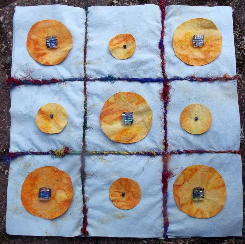
The quilt above is a case in point. I'm very fond of penny rugs, which were made from felted wool scraps, and, whilst called rugs, were really bed or table covers. I wanted to make something that referred to that tradition, without necessarily following it slavishly. So... I took two shapes, a circle and a square. The cloth is Evolon, which I've rust dyed and then acid dyed.
The squares are beads; the large ones are made of glass. It's a (very small) wholecloth, about 12" square; the line, in this case, was first hand quilting, and then, because that wasn't strong enough, I couched sari yarn along the lines. So now, I have two lots of squares; the beads, and the suggestion of squares made by the lines. I like the idea of using embellishments like beads and buttons as an integral part of the applique design, rather than added on at the end, because it seems like a good idea...
If this is sounding like a cross between a tutorial and an advert, it is. I'm teaching this particular three hour workshop on Thursday and Saturday mornings, and there are still places available...so if you would like to come and explore with me, I'd be delighted to see you! More about all the workshops can be found here.
Tuesday, July 16, 2013
The One .err...Two...That Got Away...
No, I haven't been fishing. Heaven forfend. But I have been transfer dyeing lutradur to turn it into samples for my workshops and stand at Festival Of Quilts. Yes, it's a bit late in the day, but as you know, I've been battling demons for the past two years. The good news seems to be that I've turned a corner, and feel well for the first time in a long time. So, I'm applying myself with gusto, to make sure that I'm really well prepared to teach and demonstrate. It's the first time I've done this under my own steam, having demonstrated for Colourcraft in the past. It's scary, and a big risk. This kind of thing is Very Expensive, and I haven't been making much in the way of money recently; illness will do that to one, especially a self employed one. But I'll be bringing books, kits and myself, to show you what I'm up to, and hopefully encourage you to try some of it for yourself.
Anyway.... yesterday, I painted a lot of papers. Some of them are monoprints, like the red heart shape, others are painted pretty much at random, mostly intended for colouring lutradur for beads. So far so good, huh? The monoprints are fine. It was when I looked at the results of the random painting, that the trouble started. I liked them. They were interesting. This is the first one;
And what I saw, was a landscape. Rats. Fortunately, I was able to cut off one of the prints (I got four, which I merged into each other to make a long piece of cloth). Well, okay, it was really two of the prints, because I saw a landscape with a tree in it. So far so good, huh? The second piece of cloth, I thought, was much simpler. I saw a sunset, in an individual print, so I cut it off, thinking that I now had lots of multicolour cloth to cut up for beads...good, right? So I squared up to it on the cutting mat and.... couldn't...
Now those of you who have met me in person will know that one of my mantras is, cut it, there will be a better bit along in a minute.... But I really can't bring myself to cut this up...so I'll have to see what it suggests. I usually have Much More Willpower Than This when it comes to cloth. Clearly I'm Going Soft. Telling myself I can hang it in my booth, doesn't really help, either.... Ah well. These things happen. Sometimes. Cough. Oh well, back to the beads...
ps in case you're wondering what I'm teaching, it involves pretty postcards, lutradur beads, monoprinting and a wee bit of appliqué (or cloth) design... hope I'll get to meet some of you in Birmingham this year.
Monday, July 08, 2013
More KISSes...
I did some printing a couple of weeks ago, trying out some new blocks; I wrote about it here. I liked this simple leaf block, and it printed fairly well. I'd intended the motif for using individually, on little cards, but thought it might be interesting printed on fabric, too. So I tried it on a postcard sized piece of lutradur, as you can see here;
I began printing using red fabric paint (from Colourcraft, for those of you who like to know these things...), making the two strong leaf shapes to either side of the lutradur. Boring, I thought. So, without removing the remains of the red fabric paint from the block, I added some blue, and overprinted. That, I thought, was more like it. But I still didn't like the contrast of the white against the red and lilac/blue. So... I decided to transfer dye it, using some yellow that I had lying around... and here's the result.
I'm really rather pleased with that; it's a lot warmer. I can't decide whether the leaf shapes really are leaves, or whether they are massed shields... either way, they're ready for stitch. Just have to decide what to put beneath it; lutradur being semi transparent, different colours behind will have differing effects on the piece. Ah, decisions, decisions...
Above all, it's amazing to me what can be done with a simple block and an enquiring mind!
Tuesday, June 25, 2013
KISS, KISS...
...but not necessarily of the smoochy variety... Keep It Simple, Stupid is one of those annoying acronyms from the world of business. And you don't get much simpler than the image below. Dye printed on white prepared cotton, using the cheapest, simplest and most readily available 'stamp'... my own hand.
The one thing that everyone says after one of my classes is...but it's so simple. Err... yes. Who said it had to be complicated or difficult? The secret is, there is no secret. Use what there is to hand (no pun intended!), try it and see for yourself.
It's particularly interesting to look at this cloth close up, when the hand shapes disappear, and what is seen is just some interesting marks...
If I hadn't already told you that these were finger marks, you might not have seen them that way...but I did, and now, I suspect, you will have difficulty seeing them as anything else, such is the power of the human mind when it comes to interpreting context and content. But it's still the best piece of cloth I've made in the past couple of days, so I'm a happy person! What do you think? Do you like it, too?
The one thing that everyone says after one of my classes is...but it's so simple. Err... yes. Who said it had to be complicated or difficult? The secret is, there is no secret. Use what there is to hand (no pun intended!), try it and see for yourself.
It's particularly interesting to look at this cloth close up, when the hand shapes disappear, and what is seen is just some interesting marks...
If I hadn't already told you that these were finger marks, you might not have seen them that way...but I did, and now, I suspect, you will have difficulty seeing them as anything else, such is the power of the human mind when it comes to interpreting context and content. But it's still the best piece of cloth I've made in the past couple of days, so I'm a happy person! What do you think? Do you like it, too?
Monday, June 24, 2013
Breaking My Own Rules
I've spent a long time encouraging people to break 'the' rules. There's a lot of talk in quilting about the 'quilt police', and the long litany of rules that apply if you want your quilt to be taken seriously by the quilt cognoscenti. So I give talks about 'The Rules of Quilting', in which I talk about what the 'rules' really are, why they are and when to ignore them. And I don't get myself overly riled up about technique.
So, I was surprised to discover that, as well as these commonly recognised rules, I have been working under unconscious rules of my own. I was dye painting and printing today, and, just before I packed up for the day, I painted these two pieces. I think they are the beginning of a series of work in which I explore colour in general, and dye painting in particular. I had run out of plain material to work with, so I picked up a piece of hand dye in reds and oranges, and painted on top of that. I'm calling them Rooted In Red, because, in truth, they are; they began as red, with yellow added.
So...what rule did I break? I realised that, until now, I had always dye painted on white fabric. Nothing wrong with that, but when it becomes a rule, it stops you seeing the other possibilities that exist. If there is a rationale behind that 'rule', it is probably that working colour on top of colour could possibly give you mud, not clear colour. These, though, don't seem muddy, and I'll be interested to see how they turn out.
I came to break the rule because I had a piece of blue fabric ready to paint, and and had some success with that, so the leap to working with multicoloured cloth was not such a huge one. I wonder what other 'rules' I place on myself...and how I can break them...and the limitations they put on my work.
So, I was surprised to discover that, as well as these commonly recognised rules, I have been working under unconscious rules of my own. I was dye painting and printing today, and, just before I packed up for the day, I painted these two pieces. I think they are the beginning of a series of work in which I explore colour in general, and dye painting in particular. I had run out of plain material to work with, so I picked up a piece of hand dye in reds and oranges, and painted on top of that. I'm calling them Rooted In Red, because, in truth, they are; they began as red, with yellow added.
So...what rule did I break? I realised that, until now, I had always dye painted on white fabric. Nothing wrong with that, but when it becomes a rule, it stops you seeing the other possibilities that exist. If there is a rationale behind that 'rule', it is probably that working colour on top of colour could possibly give you mud, not clear colour. These, though, don't seem muddy, and I'll be interested to see how they turn out.
I came to break the rule because I had a piece of blue fabric ready to paint, and and had some success with that, so the leap to working with multicoloured cloth was not such a huge one. I wonder what other 'rules' I place on myself...and how I can break them...and the limitations they put on my work.
Saturday, June 22, 2013
Printing Petite....
Well, I've got my technology sorted out (look mom, new card reader...), so I thought I'd continue talking about the print proofing I was doing at the beginning of the week. I wonder if you can guess the size of this particular block?
Well... it's just under 4" long, and less than 1/2" wide... that's small... I had cut a square from a rectangular block, and had this little bit as scrap. I don't believe in wasting materials, so I thought I'd see if I could carve it. As you can see, I could. I deliberately kept it very, very simple. I thought it printed out pretty well. I then tried printing in several colours, below.
then I took a couple of ACEO sized cards, which had been sprayed with Brusho, and printed the small block repeatedly over their surfaces. The one on the left was printed in blue alone; the one on the right was double printed, first in blue, then in yellow. I think they are both interesting, but I do particularly like the double print, which, I have to say, looks better in real life than in a photo. Ain't that the way...sigh.
And, of course, a block like this would make a great border print on a card or a piece of fabric, for that matter.... Small, in my mind, is definitely beautiful!
Well... it's just under 4" long, and less than 1/2" wide... that's small... I had cut a square from a rectangular block, and had this little bit as scrap. I don't believe in wasting materials, so I thought I'd see if I could carve it. As you can see, I could. I deliberately kept it very, very simple. I thought it printed out pretty well. I then tried printing in several colours, below.
then I took a couple of ACEO sized cards, which had been sprayed with Brusho, and printed the small block repeatedly over their surfaces. The one on the left was printed in blue alone; the one on the right was double printed, first in blue, then in yellow. I think they are both interesting, but I do particularly like the double print, which, I have to say, looks better in real life than in a photo. Ain't that the way...sigh.
And, of course, a block like this would make a great border print on a card or a piece of fabric, for that matter.... Small, in my mind, is definitely beautiful!
Labels:
aceo,
print,
printmaking,
small
Thursday, June 20, 2013
There's Nothing Worse...
...than sulking technology. In my case, it's a card reader which point blank refuses to read the card with my images on (or any other card, for that matter...). Grf. So the images I meant to use for this post are not available until I go get another one. So I'll talk about the rest of the printing another time. Meanwhile, back at the ranch...I'm dyeing. My hands are blue, cobalt blue, but my cloth is a variety of hues, from pale green to rich brown. I haven't dyed in a long time, and I had forgotten how much I enjoy it. I'd also forgotten what it means to lug two gallons of water down to the shed...but that's another complaint entirely. I'm dyeing cottons and silks, as well as some tshirts and a few onesies, just because they're there, and I can... I think the lilac one will be cute... The image above is of a previous session (that sulking technology strikes again...).
And when I'm done with low immersion dyeing, I'll thicken the leftover dye, and paint with it, though probably not today; there's a fridge in the shed, and the thickened dye will keep in there for up to a week. I like dye painting; it's more relaxed than formal painting. That said, I have a painting in my head that needs to be put onto canvas, or at least board... so I may sit in the shed this afternoon and see if we can come to some sort of agreement about what it needs to look like. I love painting on a large scale, but these seem to want to be small... it's a completely different discipline.
My paintings are usually full of movement and energy. At the moment, I'm personally low on both...so I think I'll try to reflect that, as in this painting, 'Tranquil'. It's not as small as I'm planning to work, but it is small by my standards lol. The problem with painting large, of course is what to do with it when you're done... my house is too small to actually hang these works, and nobody seems to want to buy them. I'm contemplating lending them to a local hospital or public space of some kind, as they are currently in the shed, and in the way. Large painting, anyone?
And the card reader isn't the only technology that's sulking. Our broadband is dipping in and out, more out than in (as it were), so, having written this, I can't publish the damn thing... oh well. Back to the shed.
Tuesday, June 18, 2013
No Comment.
Well, you know, I keep saying I'm coming back to blogging, but then I keep underestimating how severe the depression has been over the past three years or so. Merely putting on a happy face and continuing to work just hasn't done it, so I haven't been making, and therefore not blogging. I am, however, hoping that I'm climbing up the other side of a very deep black hole; therefore, I'm not making any promises about blogging. I'm here today; I might not be here tomorrow. Regardless, though, I hope you know that I do think about my friends in the world of blogging, and thank you for persevering.
It's been a difficult week (and it's only Tuesday...sigh...). Recognising it was going to be hard, I bought myself some gerbera, which always cheer me up (what, you didn't think I grew them, did you???). When I'm coming out of a depression, I begin to realise how muany things I've neglected, and what I need to do to put things right. The studios look as if bombs have gone off in them, and I've spent a bit of time in the shed today, putting things to rights. In the kitchen too... I had left a lot of the plastic jugs and buckets I use for dyeing outside for...err... rather a long time... so they needed a good scrubbing. I don't have plumbing in the studio, so it all got dragged up the path to the house, hosed off outside and finally scrubbed in the kitchen sink. Mwah. I'm now ready to dye, and the garden looks a bit better for it, too... no surprises there. Most of the improvement to the garden, though, is thanks to two lovely young chaps who are gradually working their way through much neglected borders, cutting things back, digging things up and generally being helpful. Including unearthing a LOT of buckets...not sure whether to be grateful or not.
This afternoon, though, I felt that I really had to make something. So, I looked out some lino blocks that I cut at one of the markets I take the work to, and decided to test print them. No matter how careful you think you've been in cutting the pattern out, there are always places on the blocks where you haven't quite cut enough away, making odd little marks on the print. Now I don't mind odd little marks, but I'm planning to make some greetings card type prints, and the General Public tends to have a much tidier mind than me, so I'm being Very Careful. To my surprise, the leaf print was absolutely fine, no further cutting required. Here it is printed on an ACEO sized board which I'd sprayed with Brusho.
But it really wasn't enough... so I added another one... different colour, same block...
Better, huh? More interesting, anyway. Probably not the best quality printing you've ever seen, but it's a reasonable composition, and I think I'll play with that idea on a larger, or rather, longer, scale; it would make an interesting printed border. The flower, though, was not so well cut; look at the extraneous marks...
And as well as the unwanted marks, there are one or two places where the petals themselves haven't worked well. They need a trim, as well as removing all the odd bits and pieces. That's a job for this evening, in front of the tv. I have one of those trays on pillows, which is ideal for cutting lino blocks on my knee.
And then there was the little word... Joy. Joy, my granny. No joy at all... lots of wee annoying bits to take out... but it will, I hope, be worth it...
As you can see, haven't quite got it right, yet... and too much paint, too... (as a believer in Making Things Difficult For Myself I'm working with fabric paint rather than printing ink... this is probably A Mistake, but hey, I've done it now. Besides, most of the time I'm working on fabric, anyway...).
And, when I noticed the too much paint bit, I thought I'd try a ghost print... and preferred it to the first one...
So...the manner in which I apply the paint needs to be considered...
In the spirit of change in which I'm working, I even tidied up after myself, so I can go in the shed tomorrow and dye. Note the spelling! If you would like to make comments on the post or the quality of the printing, please feel free. I answer when I can, particularly if you ask me questions... which I welcome too. More tomorrow, I hope.
Friday, January 04, 2013
The Artist Who Cried Wolf.
That would be me. I talked for most of last year about change...changing my work focus, changing my life, changing all sorts of things. I talked up the proverbial storm... but didn't actually do anything. Well, I did do some things... I started two new blogs, as if making more work for myself would actually help anything (it didn't). Recently, though, I've been talking to a business advisor, the wonderful Chris Leighton, for whom I occasionally work as a volunteer mentor. I now have A Plan (cunning, business), and A Schedule (relentless). And I feel Much Better about everything.
So what am I going to do? Well, that would be telling...but right now, I'm clearing the decks and getting ready to start properly. Part of the problem, believe it or not, is that I have too much stuff, and therefore, the more than ample three studios (read it and weep...) I have to use have Not Been Enough. So... I've been selling off my commercial fabric, and that has given me a lot more space for starters. I'm allocating different types of work to different places...seems obvious, right? But it often isn't; I had two cloth studios in the attic, and pieced in one room, and quilted in another, with felting/embellishing floating between the two. It so didn't work. So now, all the sewing is done in one room. The embellisher, dry feltmaking stuff and hat making lives in the other, along with all my textile books. Wet stuff, eg making hat bases using blocks, dyeing and silk paper making, live out in the Little Green Shed. The only strange thing that lives out in the shed is my cutting table. Ideally, I would have it in the house, but because the rooms are attic rooms, the headroom in them is limited, and therefore, the useable space is, also. There just isn't room for my cutting table, so anything that needs cutting has to be taken out into the shed. It's not ideal... but then what setup ever is, unless you can build it from scratch? This way, I get to keep bulky stuff like wadding and bolts of cloth in the LGS, and that frees up a lot more space in the cloth studios. Hurrah!
I'm also 'clearing up' my blogs. Rather than having several, as I have at present, I've decided to amalgamate them into one. It seems silly to be spreading myself so thin, given that the other blogs are only really covering stuff I talk about here, anyway. It seemed like a good idea at the time...but hey. I will be leaving them open, because there is some useful information in them, but there will be a clear link back to this blog, so that everyone can see what's going on! Hopefully that way, it'll be easier to keep talking; one or two blogs are doable.... five is overkill. Normal service will be resumed, etc...
Thank you to all my loyal readers who have stuck with me through what has been a really difficult year. I hope you'll enjoy and benefit from my change of direction, which I'll be talking more about in the next week or so... I promise!
Subscribe to:
Posts (Atom)