...now what? I'd made the pieces that needed to be made, that suggested themselves, and I really didn't know what to do next. Yes, I'll be making more work about ME: in fact, I know what's next, and I'll work on that when I have a bit more energy. In any case, it'll be done in stages, and won't be a book, or at least, it isn't a book in my head right now. Though I will admit, it could be done in book form...would be quite effective... would be better... okay, that's that sorted. Not an accordion book, though, a pamphlet. But I digress. As usual. For now, for the accordion books, ME wasn't a theme I was ready to address. I'm a great believer of building time into process; Borderlines is still waiting for stitch, but as I don't yet know what to do, I'm giving my unconscious more time to work it out. Better that than doing something half hearted, and then hating the piece for not being quite what I wanted.
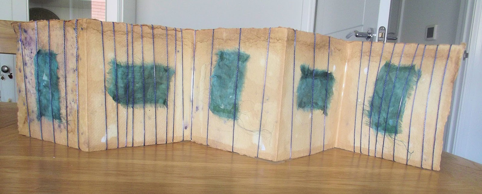
Anyway... I had another khadi natural dyed accordion. The first page is very speckled with purplish dots, and there are a few scattered through the rest of the book. That in itself is a lesson; there's something about working with the dyestuff in such a way as to ensure that the whole book is dyed in a similar fashion, rather than having one striking page and the rest, not so much. I'm going to let myself off a scolding, though, given this was the first time I'd ever done natural dyeing. You don't know what you don't know, in that situation.
Struck me that the palette for this book needed to complement that purple, so I got a piece of my own hand dyed silk organza in blue, the colour of sky when it's beginning to think about rain, but hasn't quite gone grey, yet, a greenish blue reminiscent of the ocean. Wrapping was in my mind, too, because that had been an interesting experiment, and I wanted to try more of it. What pulled it all together, though, was reading on FB that yesterday was Prince's 60th birthday (doesn't time fly when you're having fun). Might not have been yesterday, of course, given how long it can take some posts to appear... but whatever. Purple Rain, I thought Book, I thought. Wrapping, I thought. And here it is.

There's no stitch in this piece at all; it would have been intrusive. Everything is glued (Prym textile glue, for those of you who like to have the technical details). I'm trying not to use bondaweb; it involves standing, and that gets very tiring, very quickly. In any case, bondaweb doesn't seem to do very well with sheers, surprisingly, the glue is less intrusive, you can't see it unless you're looking for it, up close and personal with the piece.
The piece is wrapped using thread, this time, hand dyed cotton perle. a blue/purple melange. I had fun varying the amount of thread I used, suggesting lighter and heavier showers (I hope).
I changed the orientation of the silk, partly to add visual interest, partly because I wanted to suggest both sea and sky. I'll leave it to you to decide which is which. Nothing to do with the song; I don't know any of the lyrics, other than the chorus!
And here's the back.
I like the way the thread slants, like rain in the wind. I also like that the thread is pulled tight in places, giving shadows; you can see it in the page on the far left. It wasn't deliberate, but it's an interesting effect, and I'll be storing it in the memory banks for further use. I feel this is a bit sparse, to tell you the truth, even for my taste. I'm contemplating adding the words 'purple rain' randomly on each page, which might help. I first have to find my pens, though, and there's three different places they might be, and no guarantee I still have the kind I want to use. I'm infinitely tidier than I used to be...but not that tidy... wish me luck!
I do love it when a plan comes together...especially when it's spontaneous. To me, that's the best kind of art; it comes from the soul.