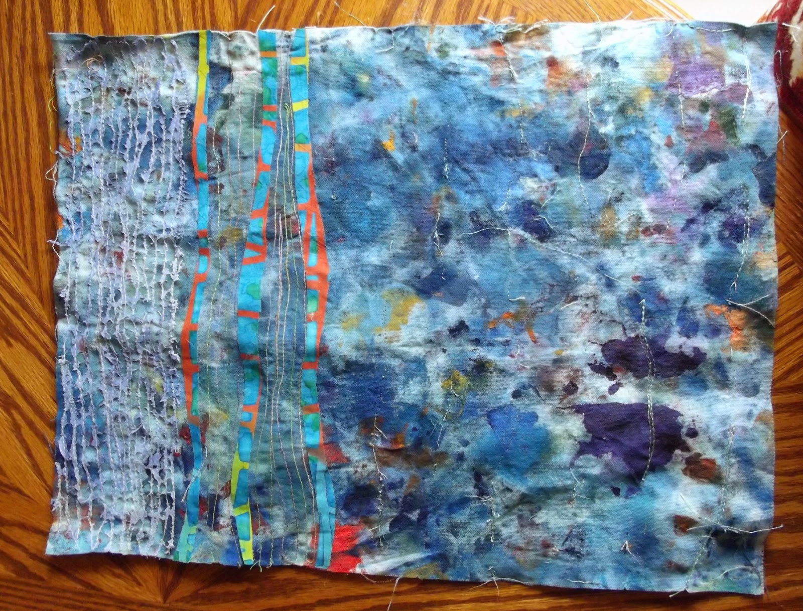
This morning, I finished off the maze book I showed you here, by writing and adding the poem.
Unless you look closely, you may not see the difference. Here's the book laid flat :
I didn't want to make it too easy to find the poem so the words are scattered over the pages in different places. The poem reads:
stone trickle
spread wide
across the barren land.
I'm contemplating adding a couple of lines of stitch to hold the book in place, although it's doing better than I thought it would with standing upright. Books made from paper have crisp folds; I've been trying to match that, but actually, it's foolish. Textile books will never have that crisp effect; it's not possible with layers of fabric, and with the nature of fabric itself. The folds are rounded, and that's okay.
This was a genuine experimental piece, made to answer the question, 'is it possible?'. Turns out it was. Often, with experimental pieces, I find that they fit into one of my themes. This is a landscape piece, certainly, possibly even an inner landscape piece, a theme I followed for a while in paint and mixed media. I don't think I ever know for sure what I'm making, and what it's about, until it is finished, even when I start out with the intention of making something that fits into an existing series. The work, and my unconscious, usually have plans of their own, and they don't always consult me about them. I like it that way. Ultimately, it's all about process....trust the process and you won't go wrong.
Showing posts with label series. Show all posts
Saturday, June 23, 2018
Wednesday, April 18, 2018
Going To Pieces.
So...what do you do when you're too physically tired to do anything, much, but your mind is turning cartwheels? Well... there's drawing, of course, and hand stitch...but I really like a jigsaw. With two cats, however, that's really not advisable; they bat the pieces all over the floor, attempt to eat them... you get the picture (or rather, you don't, because at least one piece gets lost as a result). Reader, I discovered online jigsaws, and I am hooked. I've had a wonderful time on Jigsaw Planet reconstructing other peoples' paintings and photographs. And then I thought.... maybe I could do this with my photographs... so I did.... and that was great fun, too.
So what's that got to do with the price of cheese? Well... I've talked about it elsewhere on this blog, quite recently (not that I'm obsessed). It gets more interesting when it's your own image, though. I realised a number of things.... firstly, that I don't really think about my photography as being an end in itself. I tend to take pictures either for reference, or to stitch into (see an example of my stitched work here, one of my personal favourites). So it's useful to look at these images as potential jigsaws, look at their construction, decide if they're interesting enough to use in this way.
Secondly, I already knew that I'm mostly interested in detail, so most of my photos are macro. I try to find details that might otherwise be missed. The image at the top of the post is a Norfolk flint wall (I think, if I remember rightly, it was a church in Wymondham), It makes a truly evil jigsaw; all those little stones... you have to observe carefully to fit the pieces together. The jigsaw format helps you to look at each piece separately, to consider how it fits into the whole, to see even more of those tiny details that make up what I hope is a good image, at least for reference purposes...it might want cropping if I were to print it out for stitch. Flaubert said that 'God is in the detail' (or the devil, depending on which of these similar sayings you ascribe to). Looking at an image this way seems to take me past detail, and into nuance, which usually would be picked up by my unconscious mind, but I don't think it does me any harm to contemplate them in a more overt fashion. Most of the nuances here are about texture and light; the direction of light, the way it hits a particular section of the flint, the way that flint responds.
Thirdly, I hadn't noticed until I made a couple of jigsaws that my colour palette in my photographs is very narrow, almost monochromatic. The same cannot be said for most of my work, although the ME piece I wrote about here is moving in that direction; I now have a small bag of fabric in these subdued tones and colours to make more pieces in what I suspect will be a series. I hadn't realised, though, that my photographs were leading me in that direction, probably long before I consciously chose to explore it.
Finally, the act of jigsaw assembly is not unlike the creative process. Artists and writers both talk about the blank page... jigsaws, at least, give you a jumping off point, encourage you to look for the edge pieces and assemble them to create a framework. I think we all need that in some way; my equivalent of edge pieces, in textile, is usually the creation of a small piece using whatever I have to hand (usually, up until now, from the bits lying on the floor). In paint, it comes from the process of selecting colours for my palette, which I do intuitively. I think that creating a starting ritual, and using it consistently, is comforting, but it's also a springboard into creativity.
And then there's the point where you've got the edges more or less assembled (there's always one or two that I don't find til the end, but I don't let that get in the way of assembling the rest of the image). And then I'm face to face with my own doubts; this is hard. How will I ever manage? Well... partly through intuition... that piece looks as if it should fit there... no... but it does fit two pieces along... and on I plod. Emphasis on the plod; building jigsaws seem to go in fits and starts, depending on how easy it is to group colours together, to assemble little, but obvious, details so that they can then be fitted into the whole. And there's something about perseverance, too, just keeping going, pushing through the problems (most of which are in my head) to create the image.
Yes, it's harder for artists; they don't always have a clear idea of what the end goal is, making deciding what the end product actually is, quite challenging. Fortunately, we don't have to limit ourselves to Just One Ending or Just One Process; that's what working in series is about.
If you'd like to do the stone jigsaw, here's the link; if that doesn't work, look for artmixter...I only have three images up, this one and a couple of floral ones. There are a surprising number of quilt images available as jigsaws, but I'm not sure that my work would lend itself to that kind of treatment. Above all, in jigsaws as in art, have fun.,,that's a significant part of the process.
So what's that got to do with the price of cheese? Well... I've talked about it elsewhere on this blog, quite recently (not that I'm obsessed). It gets more interesting when it's your own image, though. I realised a number of things.... firstly, that I don't really think about my photography as being an end in itself. I tend to take pictures either for reference, or to stitch into (see an example of my stitched work here, one of my personal favourites). So it's useful to look at these images as potential jigsaws, look at their construction, decide if they're interesting enough to use in this way.
Secondly, I already knew that I'm mostly interested in detail, so most of my photos are macro. I try to find details that might otherwise be missed. The image at the top of the post is a Norfolk flint wall (I think, if I remember rightly, it was a church in Wymondham), It makes a truly evil jigsaw; all those little stones... you have to observe carefully to fit the pieces together. The jigsaw format helps you to look at each piece separately, to consider how it fits into the whole, to see even more of those tiny details that make up what I hope is a good image, at least for reference purposes...it might want cropping if I were to print it out for stitch. Flaubert said that 'God is in the detail' (or the devil, depending on which of these similar sayings you ascribe to). Looking at an image this way seems to take me past detail, and into nuance, which usually would be picked up by my unconscious mind, but I don't think it does me any harm to contemplate them in a more overt fashion. Most of the nuances here are about texture and light; the direction of light, the way it hits a particular section of the flint, the way that flint responds.
Thirdly, I hadn't noticed until I made a couple of jigsaws that my colour palette in my photographs is very narrow, almost monochromatic. The same cannot be said for most of my work, although the ME piece I wrote about here is moving in that direction; I now have a small bag of fabric in these subdued tones and colours to make more pieces in what I suspect will be a series. I hadn't realised, though, that my photographs were leading me in that direction, probably long before I consciously chose to explore it.
Finally, the act of jigsaw assembly is not unlike the creative process. Artists and writers both talk about the blank page... jigsaws, at least, give you a jumping off point, encourage you to look for the edge pieces and assemble them to create a framework. I think we all need that in some way; my equivalent of edge pieces, in textile, is usually the creation of a small piece using whatever I have to hand (usually, up until now, from the bits lying on the floor). In paint, it comes from the process of selecting colours for my palette, which I do intuitively. I think that creating a starting ritual, and using it consistently, is comforting, but it's also a springboard into creativity.
And then there's the point where you've got the edges more or less assembled (there's always one or two that I don't find til the end, but I don't let that get in the way of assembling the rest of the image). And then I'm face to face with my own doubts; this is hard. How will I ever manage? Well... partly through intuition... that piece looks as if it should fit there... no... but it does fit two pieces along... and on I plod. Emphasis on the plod; building jigsaws seem to go in fits and starts, depending on how easy it is to group colours together, to assemble little, but obvious, details so that they can then be fitted into the whole. And there's something about perseverance, too, just keeping going, pushing through the problems (most of which are in my head) to create the image.
Yes, it's harder for artists; they don't always have a clear idea of what the end goal is, making deciding what the end product actually is, quite challenging. Fortunately, we don't have to limit ourselves to Just One Ending or Just One Process; that's what working in series is about.
If you'd like to do the stone jigsaw, here's the link; if that doesn't work, look for artmixter...I only have three images up, this one and a couple of floral ones. There are a surprising number of quilt images available as jigsaws, but I'm not sure that my work would lend itself to that kind of treatment. Above all, in jigsaws as in art, have fun.,,that's a significant part of the process.
Monday, July 21, 2014
... And The Heat Goes On...
and on... and on... and I do know it's unreasonable to complain about it... but hey. The Shed remains oven like... though it wasn't too bad yesterday, when I managed to get a reasonable amount done. I spent the day painting, something I haven't done in a while, and finishing off most of the prep work on some altered books; there are still two remaining that need finished, but the other three are ready to be worked in.
I'm still exploring the 'Linescapes' idea, as you can see from the images that follow;
This is an A5 image, mixed media. I like the energy in it; if they could move, those curves look as if they would be travelling at speed... Robin calls it the desert piece. Which was followed up by this;
This is a small board book, with its pages sealed together, giving the piece a three dimensional feel. I'm not so keen on this one...these lines feel too thick, and too far away from each other, too regularly spaced. Interesting, though.
And finally, this one, the best of the three, I think, Strata.
This is on a canvas board, and I think it shows some potential. Again, it's mixed media; acrylic paint and oil sticks. I like the texture of the overall piece, and I need to think some more about how to use textures in this series. I had initially wanted the lines to be raised in some way, which is fairly easy to achieve in textile, but needs a bit more thought in paint. Looking at this, though, I like the overall texture. It's reminiscent of one of the first trial pieces I made in paint, which I didn't photograph, unfortunately.
Finally, I did some work on a small piece that I was not happy with, and it has ended up like this;
About six or so inches square, on board, it's called 'Dawn In The Summer Garden'. Very gentle..and possibly not quite finished... oh well...back to the drawing board...
I'm still exploring the 'Linescapes' idea, as you can see from the images that follow;
This is an A5 image, mixed media. I like the energy in it; if they could move, those curves look as if they would be travelling at speed... Robin calls it the desert piece. Which was followed up by this;
This is a small board book, with its pages sealed together, giving the piece a three dimensional feel. I'm not so keen on this one...these lines feel too thick, and too far away from each other, too regularly spaced. Interesting, though.
And finally, this one, the best of the three, I think, Strata.
This is on a canvas board, and I think it shows some potential. Again, it's mixed media; acrylic paint and oil sticks. I like the texture of the overall piece, and I need to think some more about how to use textures in this series. I had initially wanted the lines to be raised in some way, which is fairly easy to achieve in textile, but needs a bit more thought in paint. Looking at this, though, I like the overall texture. It's reminiscent of one of the first trial pieces I made in paint, which I didn't photograph, unfortunately.
Finally, I did some work on a small piece that I was not happy with, and it has ended up like this;
About six or so inches square, on board, it's called 'Dawn In The Summer Garden'. Very gentle..and possibly not quite finished... oh well...back to the drawing board...
Labels:
linescapes,
painting,
series,
texture
Saturday, June 14, 2014
Less Is More (part two)
Okay, where was I...
So, I slept on it (not literally of course...). And when I looked at it next day, I thought... no. It's still out of balance.
The problem was three fold. Firstly, the remaining stitching was too intense. Secondly, the painted transparent cloth that I'd melted back affected the colour of the overall piece, as well as just being Too Much. And because of that colour change, the triple stripes that were at the heart of the piece were no longer the right colour. Reader, they clashed. And they were too thick, somehow, when placed against the more delicate stitching in the first section. More so in real life than in photograph. So... I continued to take stitching out from the remaining two sections of the piece. Fortunately, unlike the rest of it, these sections had been sewn with a single thread on top, making it much easier to remove. It still took most of an afternoon and evening...sigh.
That made a big difference, but not quite big enough. That colour thing was still there. So, I gritted my teeth and removed the three strips that were at the heart of the piece. That hurt. They were in the right place, but they were the wrong colour, and whilst I could have altered the colour, I really didn't want to. So I peeled them off; luckily they hadn't been ironed on too convincingly, so came off without a problem.
You can clearly see the difference in this section from the image above; much less texture, no strips, which equals no distraction from the real visual interest, the cloth itself. But it still didn't feel right. Another rotation seemed to make it better, and the addition of three lines in a different direction, made this time from wool, felted in place, made the piece acceptable.
This time, the positioning and colouring of the wool echoes and supports the colour in the cloth. It still sits securely in the 'Linescapes' series, thanks to the added wool lines. I don't think it's perfect, but early pieces in a series never are... in fact no piece ever is. If it were, we wouldn't need to make more, and a series would never be born.
I've learned a lot from this piece. Firstly, stitch is fine in its place...but its place may not be in this series. Yesterday, I cut up the rest of this cloth, and have made two further pieces, neither of which will have stitch, I think... here is one of them.
Why no stitch? In my view, there's no need for it...no room for it. The piece is fine as it is. You may not agree, of course, but that's my feeling. I'l be glad to hear if you agree or disagree.
Monday, May 19, 2014
Mixing It Up...
For a long time, I tried to keep things in little boxes, when it came to art. For someone who prides herself in working outside the box, that has never really sat well with me. My drawings didn't seem to relate to the textiles, or the paintings. But recently, I've been pushing myself to let go of those false barriers, and I finally found a theme to work to, that allows me to do that. I thought I'd show you several examples of work in the same theme. That theme is 'Linescapes'.
I've been making drawings for years that simply incorporated a minimum of three lines, or three lines and a curved shape of some kind, usually an egg shape. It struck me recently that they are 'linescapes', and that they are a way of expressing space and shape. Some of them are abstract landscapes; others are not. The images, I hope, will show you some of the potential this approach has.
These are postcard sized pieces which I drew while waiting for a doctor's appointment; Linescapes at their simplest, single colour, three simple lines and the relationship they have to each other, and to the surrounding space. I will probably add some background colour...or not... it will be interesting to see how the additional colour changes the nature of the individual pieces. The marks were made with crayon, so that I can paint over them with watercolours, but still retain the original colour of the lines.
This rather peculiar image shows a textile variation of the same theme, Lutradur XL with yarn stitched into it. It's not finished yet, I know, though I'm not entirely sure how it will progress. I know that text will feature...but that's about it. Currently, it is sitting on the window ledge in the dining room so that I can see it (and puzzle over it). The colours feel like the Scottish Highlands in late summer and early autumn. Perhaps a haiku... or two...
This is a Linescape of a different nature; far more lines, much less space. It is made using layers of transfer dyes on Lutradur XL, which were then stitched into,.
Finally, a painting. Acrylic on board, and the largest piece of work in this series so far... accompanied by the smallest, a textile ACEO.
The ACEO features yarn, hand stitched onto Lutradur XL, with a watercolour background.
I hope this selection of work gives you an idea of the potential I think this approach has for my work. I love working in series, but I've never before felt that I had found something that I really wanted to explore, and that had so much potential. This is the tip of a very large iceberg, I think... I'm going to have fun!
I've been making drawings for years that simply incorporated a minimum of three lines, or three lines and a curved shape of some kind, usually an egg shape. It struck me recently that they are 'linescapes', and that they are a way of expressing space and shape. Some of them are abstract landscapes; others are not. The images, I hope, will show you some of the potential this approach has.
These are postcard sized pieces which I drew while waiting for a doctor's appointment; Linescapes at their simplest, single colour, three simple lines and the relationship they have to each other, and to the surrounding space. I will probably add some background colour...or not... it will be interesting to see how the additional colour changes the nature of the individual pieces. The marks were made with crayon, so that I can paint over them with watercolours, but still retain the original colour of the lines.
This rather peculiar image shows a textile variation of the same theme, Lutradur XL with yarn stitched into it. It's not finished yet, I know, though I'm not entirely sure how it will progress. I know that text will feature...but that's about it. Currently, it is sitting on the window ledge in the dining room so that I can see it (and puzzle over it). The colours feel like the Scottish Highlands in late summer and early autumn. Perhaps a haiku... or two...
This is a Linescape of a different nature; far more lines, much less space. It is made using layers of transfer dyes on Lutradur XL, which were then stitched into,.
Finally, a painting. Acrylic on board, and the largest piece of work in this series so far... accompanied by the smallest, a textile ACEO.
The ACEO features yarn, hand stitched onto Lutradur XL, with a watercolour background.
I hope this selection of work gives you an idea of the potential I think this approach has for my work. I love working in series, but I've never before felt that I had found something that I really wanted to explore, and that had so much potential. This is the tip of a very large iceberg, I think... I'm going to have fun!
Friday, April 11, 2014
Being Away From Home...
can be wonderful, but also a pain... the latter, when you forget your sketch book. I had gone to the bus station to meet my friends Alison and Michael off the Inverness bus, had some time on my hands and...aaargh... no sketchbook. Usually I have two or three in my bag. Fortunately, I did find a card blank in there (no, I have no idea what it was doing there either). That, a pen, courtesy of WH Smith, and fifteen spare minutes on a bench, produced this;
I've been mulling about shapes like these ever since I got back to painting. Working in this format, though, made me wonder about making a book. And some quilts. So, an idea was born. Notice that I write all over my sketches, just to remind myself of what the thinking was at the time...it has moved on a bit from there, now.
I love the simplicity of sketches, and would like to make some stitched sketches in a similar vein... watch this space. The series seems to have a title; 'Linescapes'. These ones clearly tie up to landscape, but I think that overt marks like these will not last long; they come from one of my quilts, Norfolk Fields.
I've been mulling about shapes like these ever since I got back to painting. Working in this format, though, made me wonder about making a book. And some quilts. So, an idea was born. Notice that I write all over my sketches, just to remind myself of what the thinking was at the time...it has moved on a bit from there, now.
I love the simplicity of sketches, and would like to make some stitched sketches in a similar vein... watch this space. The series seems to have a title; 'Linescapes'. These ones clearly tie up to landscape, but I think that overt marks like these will not last long; they come from one of my quilts, Norfolk Fields.
Although there is definitely a connection between the two, I think Linescapes is really about space, not about landscape per se. It might be argued that there is no difference...but it feels like there is.Now to clear the decks so I can Get On With It.
Labels:
book,
landscapes,
linescapes,
norfolk,
quilt,
series,
space
Friday, March 14, 2014
Step Back, part two
I've always been interested in meaning, the creation of meaning, and in particular, how the brain interprets marks, whether man made or natural, to try to fit them into some sort of structure of meaning, to reach an understanding of them. The Texture Of Memory has work in it that relates to that mark making/mark interpreting interest, but there are a number of quilts that fit very nicely into the 'mark making' theme, such as this one.
It's called 'Unrequited', and has three abstract figures in it, the eternal triangle, each looking at a different 'other' with unrequited affection. At least, that's what's going on in my head, when I look at it. Some of my stitched photographic work fits into this category too, like this piece ;
It is an image taken of a section of wall in Ely Cathedral...and there are all sorts of things happening in it. I struggle to reach any kind of true understanding of it, other than that I think that it is beautiful.
Markmaking with fabric, also, as in this piece ;
Lutradur base, with fabric felted into it. To me, this reads as a landscape, and leads very nicely into the fourth category, that of landscape, or landscape inspired work. There are a number of landscape pieces, and landscape references pop up in titles all over the place in my work. Landscape was what drew me to art in the first place (no pun intended...). I wanted to be able to record what I saw...and then realised that actually, I wanted to record what I felt, about what I saw, and that rarely meant reproducing 'real life'.
The first of the landscape quilts were 'Flying Dreams' (if you search on that title, you'll come across several images and some writing about the work). This was the first of several, including one in the shape of a flying body, which now lives with Thelma Smith.
I think this has to be one of my personal favourites, it has such a feeling of space and joy in it, at least for me.
While this, Norfolk Landscape, is the most recent, a dye painted and stitched piece. I want to make more in this vein, it feels 'right' to me, somehow.
Some of hte landscape quilts included quite a bit of mark making; I made a series of them for the Evolon book. I find myself still playing with that idea in Norfolk Landscape, though it moved from a horizon based image, to a view from the air (in part at least).
Enough eye candy for one day, methinks... more next time.
It's called 'Unrequited', and has three abstract figures in it, the eternal triangle, each looking at a different 'other' with unrequited affection. At least, that's what's going on in my head, when I look at it. Some of my stitched photographic work fits into this category too, like this piece ;
It is an image taken of a section of wall in Ely Cathedral...and there are all sorts of things happening in it. I struggle to reach any kind of true understanding of it, other than that I think that it is beautiful.
Markmaking with fabric, also, as in this piece ;
Lutradur base, with fabric felted into it. To me, this reads as a landscape, and leads very nicely into the fourth category, that of landscape, or landscape inspired work. There are a number of landscape pieces, and landscape references pop up in titles all over the place in my work. Landscape was what drew me to art in the first place (no pun intended...). I wanted to be able to record what I saw...and then realised that actually, I wanted to record what I felt, about what I saw, and that rarely meant reproducing 'real life'.
The first of the landscape quilts were 'Flying Dreams' (if you search on that title, you'll come across several images and some writing about the work). This was the first of several, including one in the shape of a flying body, which now lives with Thelma Smith.
I think this has to be one of my personal favourites, it has such a feeling of space and joy in it, at least for me.
While this, Norfolk Landscape, is the most recent, a dye painted and stitched piece. I want to make more in this vein, it feels 'right' to me, somehow.
Some of hte landscape quilts included quite a bit of mark making; I made a series of them for the Evolon book. I find myself still playing with that idea in Norfolk Landscape, though it moved from a horizon based image, to a view from the air (in part at least).
Enough eye candy for one day, methinks... more next time.
Wednesday, March 12, 2014
Taking A Step Back.
Yet another one. It seems my life is composed of lots of steps backward, followed by a few forwards, and then back again. Interestingly, this seems to have led to the creation of Rather A Lot Of Work. I'm going through it now, as you know, partly because I'm working towards a new website. That has meant trawling through the work to see what there is to photograph. To my surprise, I've found that most of the work is related, even when it didn't feel that way at the time. There are several main headings for the work I've done over the past fifteen or so years. Most of it is abstract, or semi abstract, much of it it textile, but the paintings and mixed media also seem to fit fairly well into these categories, also. A lot of it could sit in more than one category; I'll talk about that as we go along. I'm still working in all five categories, I've discovered, to my surprise. If there is an underlying theme, I think it is change, and the creation of meaning within constant change.
It started with work 'about' gardens, all abstract, with incredibly simple structures, but packed with meaning. There is a complete series, unrecorded, called 'Dawn In The Healer's Garden', which is still ongoing. Each piece has been made for a friend who was struggling with something at a particular point in their lives. I continue to make and release these pieces, as a response to what they are going through. I have no photographs of them, and mention them here for completeness. Here is an image of a small piece in the gardens series; I see from the blog post that it was made for a trade, but I still have it... so it clearly didn't happen...
Most of the garden quilts take a similar format to this, though the Healer's Garden quilts vary enormously. The garden paintings, though are more like this ;
This is Spring Garden, oil on canvas. I think that what the series has in common, regardless of medium, is the concept of a riot of colour. When I think about gardens, I always imagine a gentle breeze through flower beds, making them move and intertwine... a riot of colour.
Chronologically, the next work to be made is the 'Texture Of Memory' series. These are almost all quilts, and they are 'about' depression. This was the first of them, made about sixteen years ago, just after the breakdown from hell, recording the process of burnout which resulted in my illness.
In a similar vein, this mixed media piece is called 'Losing My Religion', and is also about that time of my life.
So...that gives you a feeling for the first couple of themes in my work; more tomorrow.
Sunday, March 02, 2014
Variety...
is the spice of life, it is said. |Perhaps it is. I never make the same thing twice, there is always a twist in there somewhere, that makes whatever it is different to whatever it was. Low boredom threshold? Perhaps. I prefer to look at it as curiosity, plain and simple. So... you saw the seeds yesterday; here is another version.
The print itself is identical, but this time, it has been printed onto Lutradur XL. That immediately makes it almost impossible to create the kind of depth through stitch that working into Evolon with batting produced in the previous version. To add texture and colour, I put a sheet of green florists wrap (similar to fine Lutradur) over the whole piece. That, however, removed most of the contrast from the piece, so I cut it back to expose the dark background.
Oddly, the Evolon piece looked well balanced; this one did not. So, out came the rotary cutter, as you can see from the bottom. I cut a chunk off, and then cut the chunk into two unequal parts. My original intention had been to cut the smaller up for jewellery, but decided I liked it as it was.
I also felt that, like the previous piece, there was a need for the dark, metallic stitch that enhanced the contrast. So, I stitched the two pieces in different ways, to see what would happen.
This is the smaller of the two pieces, with fairly intense stitching similar to the previous piece in the dark areas. I then went on to stitch quite intensively in the rest of the quilt. The florist's wrap had obscured some of the detail of the photograph, and I wanted to reinstate it.
I then went on to work on the larger of the two pieces.
This time, the stitch in the dark areas is simply echoing the shape of the negative space; again, I've added quite a bit of stitch in the rest of the piece.
In writing, I realise that I have decided not to add further stitch to the larger piece. It seems to work nicely as it is; perhaps it is because of its size. Or perhaps there is more detail visible. Either way, looking at it this morning, I find I like it as it is...and so will leave it alone. Nor had I considered cropping the other, quilted piece; it is fine as it is.
I found myself tagging this with 'free motion quilting'. In fact, it would be closer to the truth to say free motion embroidery; most of this piece has just one thick layer. It does contrast nicely, I think, the difference between working with quilt, and working with embroidery. Personally, I don't think the label matters much. I just appreciate the pieces for what they are. If they have to have a label, I prefer to think of them as art.
The print itself is identical, but this time, it has been printed onto Lutradur XL. That immediately makes it almost impossible to create the kind of depth through stitch that working into Evolon with batting produced in the previous version. To add texture and colour, I put a sheet of green florists wrap (similar to fine Lutradur) over the whole piece. That, however, removed most of the contrast from the piece, so I cut it back to expose the dark background.
Oddly, the Evolon piece looked well balanced; this one did not. So, out came the rotary cutter, as you can see from the bottom. I cut a chunk off, and then cut the chunk into two unequal parts. My original intention had been to cut the smaller up for jewellery, but decided I liked it as it was.
I also felt that, like the previous piece, there was a need for the dark, metallic stitch that enhanced the contrast. So, I stitched the two pieces in different ways, to see what would happen.
This is the smaller of the two pieces, with fairly intense stitching similar to the previous piece in the dark areas. I then went on to stitch quite intensively in the rest of the quilt. The florist's wrap had obscured some of the detail of the photograph, and I wanted to reinstate it.
I then went on to work on the larger of the two pieces.
This time, the stitch in the dark areas is simply echoing the shape of the negative space; again, I've added quite a bit of stitch in the rest of the piece.
In writing, I realise that I have decided not to add further stitch to the larger piece. It seems to work nicely as it is; perhaps it is because of its size. Or perhaps there is more detail visible. Either way, looking at it this morning, I find I like it as it is...and so will leave it alone. Nor had I considered cropping the other, quilted piece; it is fine as it is.
I found myself tagging this with 'free motion quilting'. In fact, it would be closer to the truth to say free motion embroidery; most of this piece has just one thick layer. It does contrast nicely, I think, the difference between working with quilt, and working with embroidery. Personally, I don't think the label matters much. I just appreciate the pieces for what they are. If they have to have a label, I prefer to think of them as art.
Saturday, January 25, 2014
Rewriting History...
or, in this case, restitching a piece. I told you here that I intended to take some of the stitching in one of my rusted pieces out, so that I could do it again; well, once I'd started, I couldn't stop. All of it, gone. This particular piece was the third that I'd made of rust dyed silk, in what I thought was a series called 'Flotsam'. The first I've already shown you, but I'm going to show it here, too, for the sake of comparison.
The second, framed in a similar way, is this one;
I used very little stitch, just enough to keep it interesting, in the same thread that I used in the third piece. I clearly intended to make the second and third pieces very similar in nature, as the latter also had very little stitch in it. But while the second piece has flow to it, encouraged by the stitch, the third piece didn't, The stitch seemed to create little stagnant pools of stillness, which weren't good to look at. I was happy enough about it at the time...but with hindsight, it just Didn't Work.
This was what it looked like before...
And... here is the final version (believe me, I'm not taking this lot out again!).
Much more stitch this time. The piece feels very lively, as a result. I decided that I preferred it the other way round, and as the piece of mother of pearl came off during the process, I turned it over to give a bit more contrast between it and the background. The thread is a lovely variegated hand dyed brown with hints of gold and yellow.
I work often in series. What I hadn't realised was that that can be a curse, as well as a blessing In this case, I was so busy linking this piece with what had gone before it, that I failed to look at the piece itself, and see what it needed. I've done that now, and I'm pleased with it. And oddly enough, it links very nicely with the original starting place of the series...so there is a natural, rather than a forced, connection. All in all, a useful piece of learning.
The second, framed in a similar way, is this one;
I used very little stitch, just enough to keep it interesting, in the same thread that I used in the third piece. I clearly intended to make the second and third pieces very similar in nature, as the latter also had very little stitch in it. But while the second piece has flow to it, encouraged by the stitch, the third piece didn't, The stitch seemed to create little stagnant pools of stillness, which weren't good to look at. I was happy enough about it at the time...but with hindsight, it just Didn't Work.
This was what it looked like before...
And... here is the final version (believe me, I'm not taking this lot out again!).
Much more stitch this time. The piece feels very lively, as a result. I decided that I preferred it the other way round, and as the piece of mother of pearl came off during the process, I turned it over to give a bit more contrast between it and the background. The thread is a lovely variegated hand dyed brown with hints of gold and yellow.
I work often in series. What I hadn't realised was that that can be a curse, as well as a blessing In this case, I was so busy linking this piece with what had gone before it, that I failed to look at the piece itself, and see what it needed. I've done that now, and I'm pleased with it. And oddly enough, it links very nicely with the original starting place of the series...so there is a natural, rather than a forced, connection. All in all, a useful piece of learning.
Labels:
Flotsam,
reworking,
rust dyeing,
series,
silk
Wednesday, January 22, 2014
One Thing Leads...
to another... at least if you're me. Someone bought a journal cover from me on Etsy, but the size was wrong, so I suggested I made her one that would actually fit... and that's what I've been working on today.
As always, this is similar to the original, in process and look, but it is also quite different, so I hope she likes it. This dotty, vaguely action painting style is typical of my paintings, but not so much my textiles, until recently.
Spring Gardens, above, is one of the paintings I'm talking about, though this one is a much more controlled application of semi random dots. I've recently been wondering about why I didn't bring painting and textiles closer together, and the journal covers have been the result. Until today, when I took things a bit further... like I said, one thing leads to another.
I liked the black/white/grey dots on the cover, so wanted to try that out in a piece for stitch...which led to this;
I like this one, it's got real potential, though perhaps not with this orientation. So then, I wondered, what about changing the background... and got this;
I rather like this one, too. Originally, it just had a blue background, but I felt it needed something else, so added a flash of yellow, which I think makes it dramatic. It has the feel of a monoprint, to some extent, really quite painterly. The 'bird' in the foreground originally only had one 'wing', so I looked for a mark that seemed similar, and added it; I think it looks good....or at least, balanced. I'm questioning whether I need to add stitch to this, it looks good on its own.
And finally... I had to trim a bit off from the original fabric, so grabbed an interesting looking background paper, and got this;
Four very different pieces, derived from the same basic approach, and the same base papers. Isn't transfer dyeing a wonderful thing?
ps thanks to everyone who was so encouraging in response to my last post, it's much appreciated.
Thursday, January 09, 2014
New Directions.
Firstly of course, Happy (if belated) New Year! Our festive season introduced us to a new person, our grand daughter, Cara, who was born shortly before Christmas...here she is on her quilt...well, okay, half her quilt...
The quilt features some of my hand dyes, as well as some hand painted and printed fabric, along with a mixture of commercial fabrics. I wanted to make something that represents my creative life, as well as something pretty..I think I achieved what I wanted to The quilting is different in every block, featuring hearts and flowers, as well as a doll like shape, plus some stylised Macintosh roses, for a Scottish baby. Though Charles Rennie was credited with these, it was, in fact, his wife, Margaret MacDonald, also an artist, who designed such motifs. She was a skilled artist, working in textiles and other media. I hope she'd approve of my use of her motif. More information about her is to be found here.
But I digress. As usual.
Last year was difficult, for a variety of reasons, and it looks like this year will be little different. I've been struggling with the demon depression, and my lovely husband has been struggling with unemployment, also a demon, with its own nasty consequences. So this year is the year where I don't spend any money, but try to be as creative as possible with what I have, and with what surrounds me. What I have, is quite substantial; like all quilters, I've got a substantial stash of cloth and threads. And plenty of ideas about what to do with them!
I've been inspired, recently, by the work of a new Facebook friend, Fabienne Dorsman-Rey; check out some work and an artist's statement by her here . She kindly suggested the book 'Eco Colour' by India Flint as a starting point, and I was given it for Christmas.. So, any dyeing I do this year, is likely to be of the natural variety. But I had already started down that path a couple of years ago; if you are familiar with the book 'Exquisite Evolon', you will know that I give instructions for rust dyeing that most flexible of fabrics. Mainly, though, I have rust dyed silk and cotton, and started a series of work called 'Flotsam', featuring hand stitched rust dyed silk with found objects. This is the first of the series;
...and here is a detail;
I'm particularly fond of the piece of wood at the bottom of this image; its textures seem to echo the textures created by the hand stitching. I started out machine stitching this piece, but soon realised that it just didn't look right to me. Machine stitching gives a hard, regular line, regardless of how you vary the stitch length within the line. That seemed lacking in the subtlety that the cloth shows, so I removed it, and started again by hand. I think the piece has benefited from it, regardless of how long it takes. It is, of course, a good thing to pick up and put down, and to take with me on journeys. I find myself using hand stitch more and more, either in conjunction with machine stitch, or on its own. It feels very personal.
So, I have looked out two large pieces of rust dyed silk... more in my next post.
The quilt features some of my hand dyes, as well as some hand painted and printed fabric, along with a mixture of commercial fabrics. I wanted to make something that represents my creative life, as well as something pretty..I think I achieved what I wanted to The quilting is different in every block, featuring hearts and flowers, as well as a doll like shape, plus some stylised Macintosh roses, for a Scottish baby. Though Charles Rennie was credited with these, it was, in fact, his wife, Margaret MacDonald, also an artist, who designed such motifs. She was a skilled artist, working in textiles and other media. I hope she'd approve of my use of her motif. More information about her is to be found here.
But I digress. As usual.
Last year was difficult, for a variety of reasons, and it looks like this year will be little different. I've been struggling with the demon depression, and my lovely husband has been struggling with unemployment, also a demon, with its own nasty consequences. So this year is the year where I don't spend any money, but try to be as creative as possible with what I have, and with what surrounds me. What I have, is quite substantial; like all quilters, I've got a substantial stash of cloth and threads. And plenty of ideas about what to do with them!
I've been inspired, recently, by the work of a new Facebook friend, Fabienne Dorsman-Rey; check out some work and an artist's statement by her here . She kindly suggested the book 'Eco Colour' by India Flint as a starting point, and I was given it for Christmas.. So, any dyeing I do this year, is likely to be of the natural variety. But I had already started down that path a couple of years ago; if you are familiar with the book 'Exquisite Evolon', you will know that I give instructions for rust dyeing that most flexible of fabrics. Mainly, though, I have rust dyed silk and cotton, and started a series of work called 'Flotsam', featuring hand stitched rust dyed silk with found objects. This is the first of the series;
...and here is a detail;
I'm particularly fond of the piece of wood at the bottom of this image; its textures seem to echo the textures created by the hand stitching. I started out machine stitching this piece, but soon realised that it just didn't look right to me. Machine stitching gives a hard, regular line, regardless of how you vary the stitch length within the line. That seemed lacking in the subtlety that the cloth shows, so I removed it, and started again by hand. I think the piece has benefited from it, regardless of how long it takes. It is, of course, a good thing to pick up and put down, and to take with me on journeys. I find myself using hand stitch more and more, either in conjunction with machine stitch, or on its own. It feels very personal.
So, I have looked out two large pieces of rust dyed silk... more in my next post.
Sunday, October 20, 2013
Intuitive Working...
is my norm. I make a mark, I make another mark, in response to the first, and on it goes, until a piece is finished. In the last day or so, I've been making interesting marks on Evolon; the image above is one of the small pieces, which I decided to hand stitch. It's a series, with a working title of Organic Rhythms. The photographs don't really do it justice; it is layered and relayered with transfer dyes, and they merge to produce interesting juxtapositions of colour and shape. Click on it, to take a closer look.
I decided to hand stitch this one. I've recently been using perle and other thicker threads, but for this, I'm using a reel of quilting cotton I bought on the way home from Scotland; it so happens that it seems to reflect all the darker colours in the dyes. I started the way I usually do, selecting a shape, and filling it with stitch, then moving on to another one :
So far so good, I thought... and continued to stitch, with an increasing sense of discomfort. My stitches were getting longer and sparser, making the earlier section appear fussy and inappropriate...
... plus, it made me think of an art movement....of which I couldn't remember the name.. .in the end, I found it. Suprematism, a Russian school founded by Malevich. "The term suprematism refers to an abstract art based upon “the supremacy of pure artistic feeling” rather than on visual depiction of objects." (Wikipedia)
Which pretty much sums up my work, really...though I had never seen myself as having much in common with that particular school. It's amazing how your tastes change as you make more art. But I digress (no surprises there).
So, there was only one thing for it; the earlier stitching had to come out...and out it came. I detest unpicking...but when it has to be done, it has to be done. Leaving me with this...
I'm very pleased with it. The long stitches are interesting. Purists would doubtless be appalled, and say it Wasn't Quilting. But they are stitches, holding together more than one layer of cloth. And what's more, looked at in certain lights and at certain angles, they throw interesting shadows beneath themselves, strengthening the line. Above all, they are simple, and that's the effect I want.
Subscribe to:
Posts (Atom)