meta name="p:domain_verify" content="c874e4ecbd59f91b5d5f901dc03e5f82"/>

Pages

Showing posts with label oil paint. Show all posts

Saturday, June 14, 2014

Less Is More (part two)

Okay, where was I...

So, I slept on it (not literally of course...).  And when I looked at it next day, I thought... no.  It's still out of balance.

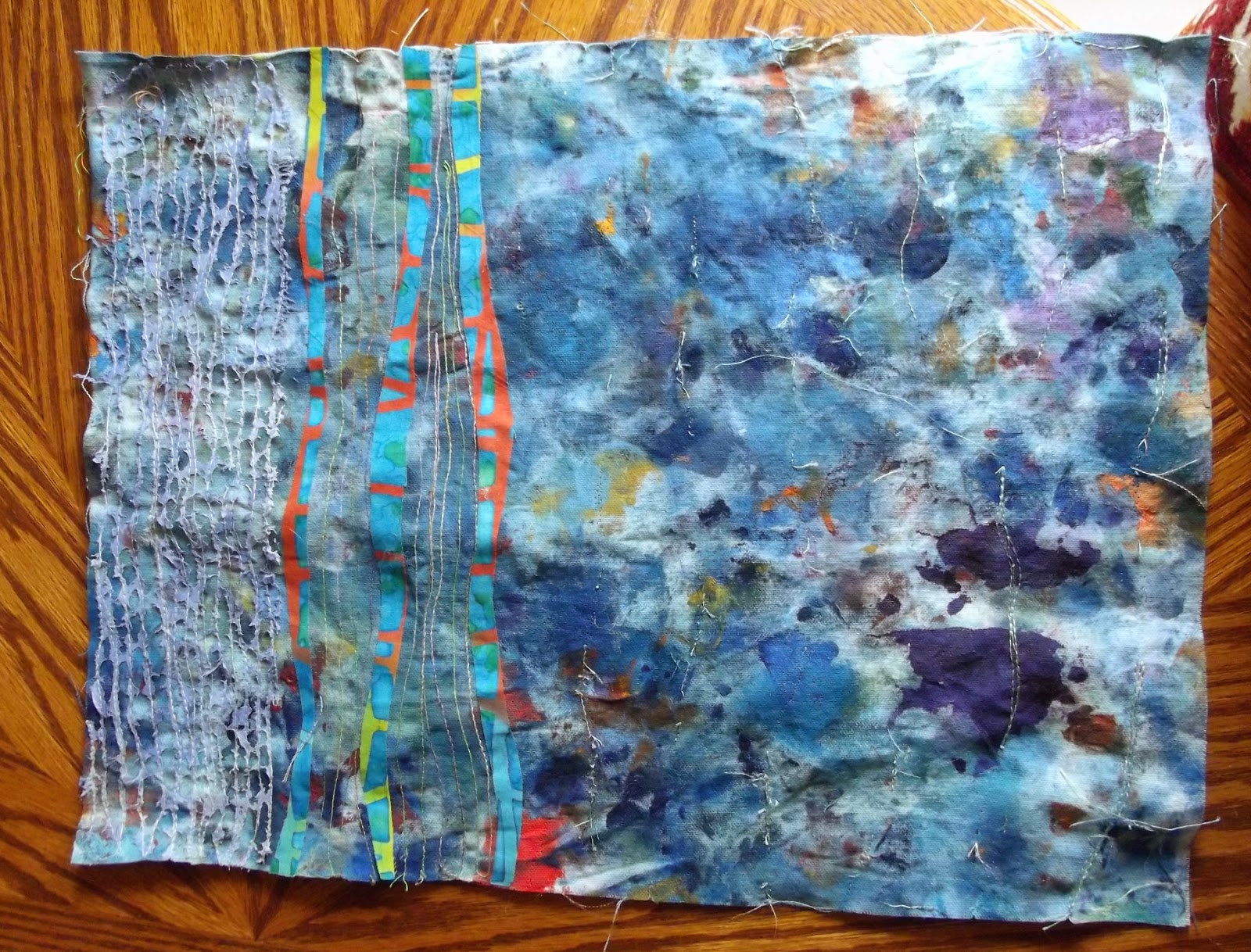
The problem was three fold.  Firstly, the remaining stitching was too intense.  Secondly, the painted transparent cloth that I'd melted back affected the colour of the overall piece, as well as just being Too Much.  And because of that colour change, the triple stripes that were at the heart of the piece were no longer the right colour.  Reader, they clashed.  And they were too thick, somehow, when placed against the more delicate stitching in the first section.  More so in real life than in photograph.  So... I continued to take stitching out from the remaining two sections of the piece.  Fortunately, unlike the rest of it, these sections had been sewn with a single thread on top, making it much easier to remove.  It still took most of an afternoon and evening...sigh.  

That made a big difference, but not quite big enough.  That colour thing was still there.  So, I gritted my teeth and removed the three strips that were at the heart of the piece.  That hurt.  They were in the right place, but they were the wrong colour, and whilst I could have altered the colour, I really didn't want to.  So I peeled them off; luckily they hadn't been ironed on too convincingly, so came off without a problem.

  You can clearly see the difference in this section from the image above; much less texture, no strips, which equals no distraction from the real visual interest, the cloth itself.  But it still didn't feel right.  Another rotation seemed to make it better, and the addition of three lines in a different direction, made this time from wool, felted in place, made the piece acceptable.


This time, the positioning and colouring of the wool echoes and supports the colour in the cloth.  It still sits securely in the 'Linescapes' series, thanks to the added wool lines.  I don't think it's perfect, but early pieces in a series never are... in fact no piece ever is.  If it were, we wouldn't need to make more, and a series would never be born.  

I've learned a lot from this piece.  Firstly, stitch is fine in its place...but its place may not be in this series.  Yesterday, I cut up the rest of this cloth, and have made two further pieces, neither of which will have stitch, I think... here is one of them.

Why no stitch?  In my view, there's no need for it...no room for it.  The piece is fine as it is.  You may not agree, of course, but that's my feeling.  I'l be glad to hear if you agree or disagree.

Friday, June 13, 2014

Less is More...

...or how this...


became this...


It's a long story.

Several years ago, I mooched a cleaning rag from a friend of mine who is a painter in oils.  I liked the look of it, and thought that it wanted stitch; she thought I was barking, but humoured me after a bit of persuasion.  And it has lain about ever since, which, given it is oil paint, was probably Not A Bad Thing.  Raking through the box it was in (the one with the interesting hand dyed/printed/painted fabrics), I thought that its time had come... and promptly cut it in half.  I liked the balance of colours and shapes, the randomness of it, the way that it suggested sea to me, somehow, perhaps because my friend had been painting goldfish in ponds... and because Turner has painted seas in this kind of palette...  who knows?

I wanted to make this the first piece in the 'Linescapes' series I have been slowly working up to; so far, I have a lot of sketches and postcards, but no textile pieces.  I thought I would approach it the same way I have the drawings, by beginning with three curving lines.  I wanted them to be quite small, because the real interest in the piece, I thought, was the painted cloth, and I wanted them to be textured.  So, I thought I'd try taking some dark green velvet, and add some other colours to it, particularly orange, through stitching, which I knew would  add texture and interest.  When I looked at it, having added a bit of stitch, though, I knew it wasn't right.  See for yourself;
Too dark.

This looked better, though...had I had enough of it, I would have used it, and the piece would be completely different.  As it was, I hadn't, so started looking through my scrap stash.


And I found this... 


...at which, a small person in my head jumped up and down with excitement.  That person is rarely wrong, so I put some fusible on a section, cut the lines out, and added them to the piece.  And stitched it.  And added some painted polyester cloth (for once, not lutradur...), and burned it back.

Reader, I hated it.  I rotated it.  I hated it less.


So I figured that I needed to work out what was wrong with it.  I decided that there was Too Much Stitch.  And if I got rid of the stitch, or at least, some of it, I'd feel better about it, because what was important in the piece was the exploration of space...and I had filled up that space with stitch, which was a distraction from what was going on in the cloth.

Okay.  So I thought I would take out a significant amount of the stitching in the larger section to the right of the turquoise/orange strips.  And I did.  And it was interesting... I didn't remove all the stitch, leaving bits and pieces of stitched mark here and there.  Look closely at the piece and you can see the holes in the canvas where the stitches were.


Here's a close up.

And that, I thought, might well be that... but of course, we both know better, because we've seen the after picture... more tomorrow.