meta name="p:domain_verify" content="c874e4ecbd59f91b5d5f901dc03e5f82"/>

Pages

Showing posts with label linocut. Show all posts

Wednesday, October 17, 2018

Growl.

Having a frustrating day (and it's not even 11 am).  Woke very early, around 5am, and couldn't get back to sleep, so read a bit, got up around 6.30am, which lots of people do routinely (like Robin, for example), but I'm so not a morning person...  Thought I would do a bit of stitch on the book from last time...here's the image of the reverse of  one of the first pages that I promised you...it works fairly well.

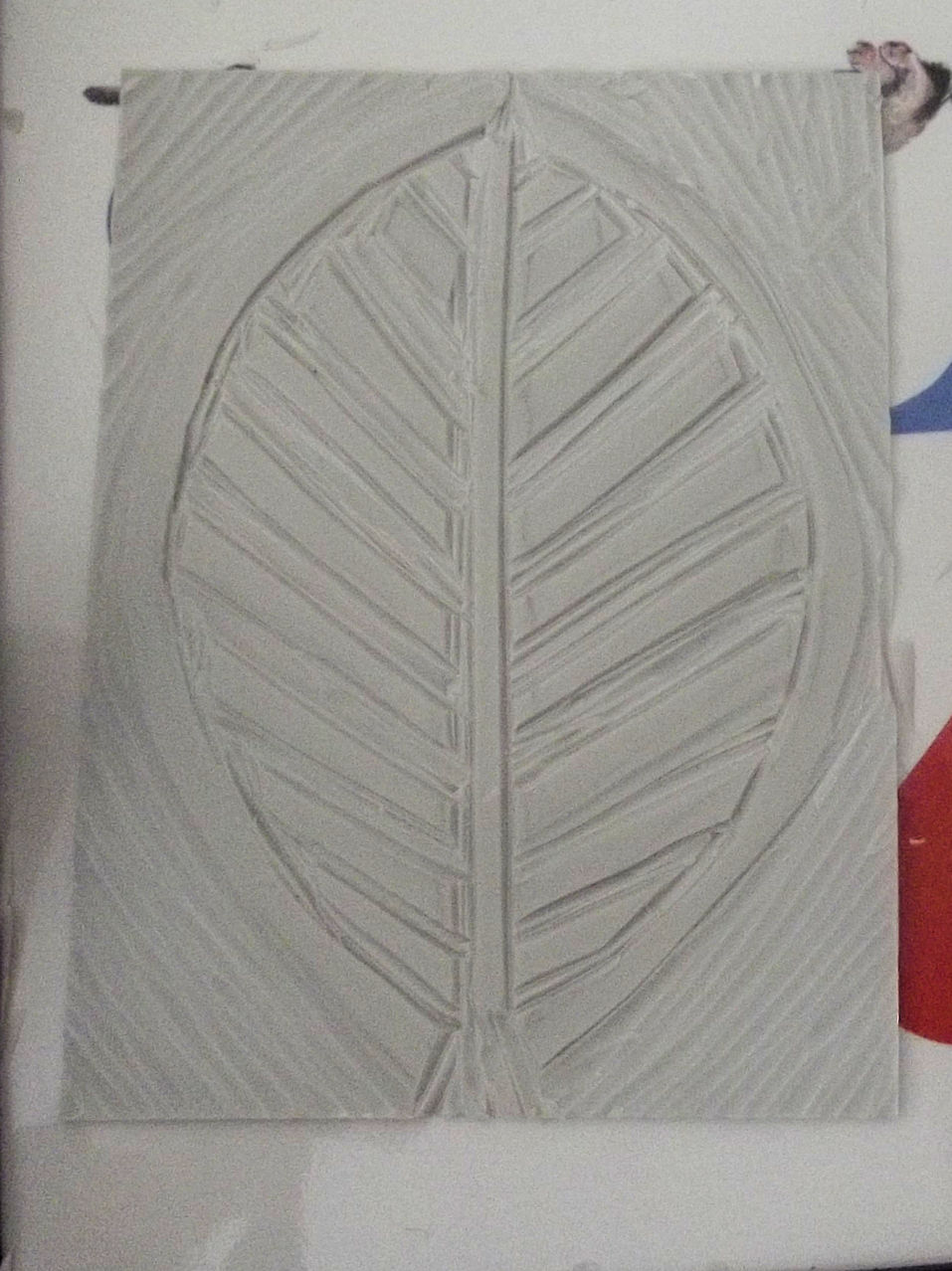
So, finished the second of the two leaves on that spread, which I had left half done, and started on the second spread.  I admit, my heart sank somewhat when I realised what I had to stitch.  One side is another one of these leaves...but the other...isn't...sigh...it's a good deal more fiddly...


So, I did one, and left the other two for another day, as my energy had dropped considerably after that.   Here's the reverse...


So...I thought I'd have a wee browse. I came across these fairly abstract goddesses while browsing through the box I showed you a few days ago...


They are rubbings of an original lino cut, using metallic Markal paint sticks, or Shiva sticks if you're in the US.  Not overly keen on the green one, but the other two seem to work quite nicely.  These were done a very long time ago, probably when I was demonstrating for Colourcraft; the fabric is a bit of my hand dye.  I was going to stitch them individually, or as they are in that pairing, ignoring the green one altogether (or cutting her up, perhaps)...but I did think, they would be more interesting 'framed' with a contrasting fabric.  Did I have a suitable fabric?  Of course I didn't.  Well, actually, I do have one that would work, but there's not enough of it.  Hey ho.  Frustrating?  Yes.  Do I really know what it is I want?  No, not really....sigh.  A batik, maybe. Do I have the energy to dye something suitable?  Oh, don't be silly...  So no, I won't be doing anything with them, anytime soon. 

So...I may not have achieved much, but I did achieve a bit.  I'm not going to consider why I'm not overly enthusiastic about the leaf book; that's altogether too big a topic for today.  Nothing seems to be working as planned at the moment. Dammit
.

Tuesday, October 16, 2018

Back To The Books...

You might remember that I made some linocuts based on a piece I made that featured spears and shields...or trees and leaves, depending on how you thought about it... see it here .  I can't find a post about the book I made through printing the blocks on Lutradur... but it has been lying around the studio, waiting for me to generate energy... reader, I started... this is the 'cover'.


I have to say, this is much more my kind of stitch.  I'm colouring outside the lines again... it matches the fairly rough and ready nature of the prints.  Here's a closer look...


Proof, if proof were ever needed, that I couldn't do a straight line if you paid me for it.  Partly that's to do with the lutradur (like I need an excuse...).... I'm used to working with at least two layers of cloth, one of which is normally wadding, or maybe velvet; this is a single layer of lutradur, and the foot is levitating above the cloth.  Every twitch of the hand shows in the stitch because it's so light, it moves in a disproportionate manner.  My hands are clearly very twitchy.  Overall, though, I don't think it detracts; it's unusual to look so closely at one particular section, like this, divorced from the whole.  And had it been a big deal to have straight stitch, I would have used a walking foot, rather than a darning foot, and all would have been...errr...regular...and probably boring. 

Note the distortion, too, again to do with the weight of the cloth.  I think it'll iron out to a great extent, and I think it gives the piece some character...it seems to age it, a bit, the way that old paper distorts and crinkles slightly as it gets older.

I ran out of steam half way through the second leaf, but it'll get done, slowly, but steadily.  I meant to take images of the back, but forgot; part of the reason for the intensity of the stitch is that the reverse side is significantly paler than the front, unsurprisingly.  I'm using a darker thread on the reverse, and it seems to be working reasonably well.  More to follow as I work through the pages.


Tuesday, July 10, 2018

Slowly, Slowly...

...may well catchee monkey, but when it's the only speed you've got, it's a pain in the bahookie.  I want to make another book,  a series of books, really, and decided it would be interesting to do it in lutradur.  The semi transparent nature of the cloth, and its natural stiffness in the heavier weights, make it an interesting choice.  And as luck would have it, I found some precut pieces in the lutradur box (this is lutradur 100), offcuts from the kits I used to sell. A bit of judicious trimming, and they were ready to take some background colour.


I chose Naples Yellow acrylic, in the end, a slightly dusky yellow that provides a good contrast to browns, but not overly dark.  I watered the paint to a watercolour consistency because whilst I want the colour, I don't want the semi transparent nature of the cloth to be hampered by the solid nature of undiluted acrylic paint; that will come with the prints I will add to the pages later.  And that's pretty much the extent of my activity today.  Fortunately, however, whilst I doubt I'll be able to do much more, I can at least think (well, for a while, anyway).

My process has always been to turn up at the empty page, or piece of cloth, and do what seemed necessary according to my inner artist, unconscious mind or whatever's in charge when I work.  That doesn't seem to work well with a book.  The writers among you (hi, Ann) will not be surprised by this, given the amount of planning, writing, rewriting and editing necessary to produce either a novel or a piece of non fiction (and don't start me on poetry...).  With a visual book, it's even more important that one's intention, at least, is clear, because, unlike a novel, the sequencing is not clear.  My intention for this particular book, is to use the spear/tree, shield/leaf motifs that I've been cutting from the lino (here's the one I'm working on just now)


And that's as far as I've got.  Because whilst I know these motifs are important to me, I'm not sure exactly why...and the why is the core of the art, both visual and poetic .  I'm not stuck, exactly.  I can poddle along with the mechanics of the making, the carving, the printing, the assembly.  I know what the centre of the book will look like, though not the cover (apparently this one needs a cover, who knew...) or the sequence of images before and after it.  And it needs a poem.  I think.  Or maybe it doesn't.  Maybe it needs random words, for now, and the poem will emerge over time.  I suspect that it's not one of these very short pieces I've been writing for the books, but rather a longer piece, that will extend across several books.  And perhaps those books will need their own case.  Or bag.  Yeah, bag.

And this is how my creativity works (you may have noticed).  It doesn't really matter if I can start with nothing, or not.  What's important, is that I keep asking myself the questions, and make, in response to the answers. 

Saturday, June 02, 2018

Making Substitutions.

So...when I don't feel great, mentally, I tend to do stuff that I don't enjoy, on the principle that a.  things can't get much worse, and b. I'll feel a lot better when I've completed whatever it is.  Of course, completing things takes me a lot longer than it would a healthy person, so the gratification element is usually delayed, but I did get a couple of those boxes unpacked.  And found my millinery stiffener, which is great, and some more softcut, which is not so great, given that I'm finding cutting blocks difficult.

That said, I've been doing a little here, a little there, when I feel energetic enough, and this one is ready for a trial print.


I've been lino printing for a long time, but I still find it difficult to gauge whether I've carved away enough of the surplus 'stuff'' for it not to print when it's inked up.  With softcut in particular, it's really easy to carve right through the block, which, of course, you really don't want to do (it affects the integrity of the block).  Yes, I did it on this one...just a very small cut through to the base, but I'm annoyed with myself all the same.  The only way to tell if you have got rid of enough of the 'stuff', of course, is a test print, because it shows you where the ink is going.  If it hits an area you don't want to print, you need to carve that away.  When I eventually get the other two boxes unpacked, and the studio cleared, I'll get that done.  Though I might wait until the other blocks are cut, first.  Here they are :


As you can see, the one on the left has been started.  It's really fiddly, and I thought, wish I'd made a stencil, instead of a lino block, would have been a damn sight easier to cut, and given pretty much the same effect...  Click.  So, if I do want to make a lino cut in future, perhaps the sensible substitute would be a stencil, either hand printed, or screen printed.  I got rid of the Very Large screens I had, but kept one small one, so that would work. 

It does beg the question, though, as to why I'm doing this at all.  Lino cuts are made so that you can produce an edition of several prints, rather than a one off print.  Let's face it, with all that work just to carve the block, you really would want more of a return that one piece.  And I don't do editions.  I get bored....and I'm no longer selling work, so what would be the point? 

Well, that train of thought stopped me in my tracks :why am I doing this exactly?  Well...for two reasons, possibly three.  The first is that I like the effect of a lino block; it's different to a hand painted motif, usually more definite.  Secondly, whilst I will only probably print these up *as a block* once, or maybe twice, I think that this shield/spear imagery will feature in more work, so though I may not print the block in its entirety, I will print elements of it.  Thirdly, and most spuriously...I can.  And I've got the stuff.  That isn't a good reason, of course; just because you can do something, doesn't mean you should.  Which is why I'll probably sell the rest of my softcut to someone who will use it.  It did strike me that I could use it as the base for mono printing (I'm still refusing to buy a Gelli Plate, don't see the point, strikes me as an expensive fad).  So I may try that; not sure if it'll work or not, but it's worth a try, and I'd rather use what I have than go out and buy More Stuff.


Saturday, May 26, 2018

Working With Metaphor

Remember this piece?  I talked about how it developed here and here


It's called Spear.  I talked with my friend Ann Godridge about its meaning.  My original intention was to create a semi abstract tree, with a leaf shape and a rectangular shape that didn't seem to have any meaning at all.  And yet it ended up feeling as if it was a spear and a shield.  I talked about how that seemed important to me, because I felt I needed some sort of defense, mainly against the attitudes of other people towards my illness.  It's not easy, having a physical illness that is dismissed as 'all in your head'.  Or when friends disappear, for whatever reason, other than the illness.  Or when I become invisible in a wheelchair.  It all hurts, and I need some sort of defense against that pain, until I get used to it all, grow a thicker skin, get used to having no friends other than the virtual ones.

I think this is the ideal example of an experimental piece turning into an expressive piece.  Playing about with those elements in an experimental way produced an unexpected depth of meaning which pleases me, and helps me to understand things better.  So I started to play around with the spear and the shield, with the intention of making a series of linocuts.  I recently bought a load of softcut, expecting to teach a workshop which was cancelled under me,  so I had a lot of 'stuff' to use, and the shapes of both spear and shield seemed to lend themselves to linocut.  So... here are three variants on this theme :


I could have made the leaf/shield shapes solid, but chose to work them as if I was making a stencil.  I think it will add a little visual interest.  I think the triangles within the leaf shapes might be too solid, but I won't really know that until I cut them, or possibly until I actually print with them.  I think it's important to remember that I'm not making prints as prints.  Rather, I'm making prints as a base for stitch.  The stitch will ultimately be more important than the print, so I want to make sure that there's plenty of room for it, and also that no single element of the print will dominate the piece.  There's a danger of that with these triangles, so it's something to watch.

I had a hospital appointment, so that was the ideal opportunity to sketch some more.  I said that I don't usually use sketchbooks to develop work, but linocut is a definite exception.  This sketchbook is exactly the same size as my blocks, so working out how the different elements will combine is useful.  I find that marks on softcut don't erase all that well, so I like to work things out properly before I mark the design. 


I think I like the bottom one better...the top one may prove to be a little cluttered.  Nonetheless, when I've got the size of the shields right, it will probably feel more balanced (one side is clearly larger than the other). 

These sketches aren't perfect; I didn't have a ruler with me, so the division across the blocks is approximate, for example, not to mention the wonky spears...  I also discovered that it's not easy to draw in a wheelchair, even in a hardback journal; no flat surface.  At home, I have my legs up on a footstool, which makes them level; they are on a slant in the wheelchair.  Don't think there's anything I can do about that, other than work in a smaller journal, which would be easier to handle.  Lugging a work board around really isn't an option....but I digress.

You can see how straightforward it is to take a couple of elements and combine them in different ways to make different images.  I have at least one other to try out.  I did have a day of panic when I couldn't find my lino cutters, which, unlike the missing felting needles, would have been expensive to replace (they're professional quality, as I really couldn't get on with the wee cheap red handled things).  Fortunately, though, I found them this morning, in just the place I thought of at three o'clock this morning....insomnia has to be useful for something.

So...more development and some cutting.  Wish me luck.

Sunday, April 29, 2018

Embrace The Unexpected.

On Friday, I got a call from my son, inviting me out to lunch with him and his daughter, Cara.  Never one to say no to a meal, and in such good company, off I went.  I came back with a couple of unexpected treasures.  They probably wouldn't qualify as treasures for anyone else, admittedly...but...
Here's the first :
Cara had a drink in a bottle; this is the lid.  It's textured; the ribs stick out.  I think it might well make a dinky little stamp.  Actually, scaled up and perhaps tinkered with a little, it would make an interesting lino cut.  A flower, maybe, or a sunburst.  Something to contemplate.

After the meal, we sat outside so that Cara could play on the equipment in the garden.  There was another family there, and a little girl gave Andrew and I each a pine cone.  Andrew was a bit bemused, I think, but I was pleased...
Not a great photograph, I'm afraid, but you get the drift... I love the way it resembles a rose.  The texture is amazing, partly its own, partly due to lichen growth.  It's one of these things that is perfect both of itself and in what it suggests. 

Where do I get my ideas from?  Absolutely everywhere.  All that is really necessary is to recognise things both for what they are, and for what they might become.

Thursday, April 19, 2018

Minor Adjustments...

...can make a big difference.  I love working with transparency, but sometimes it just feels a wee bit wishy washy...   I'm still working through those scraps, and came across this lino cut on bandage muslin, which had been rust dyed before I printed it.  I've frayed the edges a little, to add a bit of texture and visual interest, though it's not obvious in the image.
It fits a small piece of evolon like a dream...even if I have positioned it the wrong way round, sigh.  But you get the drift.  There's a piece of yarn running across the top and bottom of the piece, which I'll couch on with some hand dyed thread I found yesterday, while tidying up (handy, huh?).  But... I want to beef up the rust colour just a bit... so...I'm going to double up the muslin... clearly didn't print on all of it, fortunately. 

Not sure that it's showing up well in the image, but again, you probably get my drift.  It's a good way of working with lutradur and other patterned fabrics; the combinations can be really interesting.  Meanwhile, I need to think about stitching this...but that will have to wait until the arrival of the brown hand dyed perle I've ordered on line.  I'm just not set up for dyeing at present, unsurprisingly, though work on the studio is progressing; might show you that tomorrow.  The shelves are full, all except the one set that needs to be repositioned.  I've moved the cutting table to its proper place...just need to remove the empty boxes, shift and fill the shelves and move the work table.  Then I can get the machines out and we'll be pretty much good to go...hurrah!


Wednesday, July 16, 2014

Warm...

almost to warm to work.  Well, I'm a Scot, I'm just not used to these high temps... and am very grateful I'm not in Arizona or anywhere else that's far hotter, for that matter.  I thought I'd go and do some work in the shed, but despite the fan, it was just Too Warm, so I've come back in to fiddle with photos in the relative cool of the living room, which, as it doesn't get much sun, is one of the coolest places in the house.  Sadly, it's also one of the darkest, too... but you can't have everything, and it is quite snug in winter.  But I digress...

I went into the shed to put a couple of layers of varnish on a floor cloth that has been painted by members of the Dereham Hub; I'll show you pictures when it's finished.  Since I was on a bit of a roll, I then started working on some cloth.  I started by trying to discharge dye some cloth...but either the cloth won't discharge, or the bleach pen I found is too old, no luck...

Then, I started playing with some hand dyes.  I had intended painting onto the cloth, but instead, started working with some lino blocks.  The first piece is tentatively entitled Flowers In The Fields, and is cotton sateen, hand dyed and then printed with two blocks.
Then, I remembered explaining printing with bubble wrap to someone this morning, and, since I had some big bubble wrap, proceeded to do just that... this piece features it, 'Ferns And Flints'.


This was a section of an old cotton sheet, dyed, and then printed, bubble wrap first, then printed with a fern shaped linocut (as if the title didn't give it away...).  I think the ferns piece is simply a background, I have Plans for it... but I think Flowers In The Field might become a poem.  We shall see...  first they will wait for a while, to see if my ideas change.


Monday, June 09, 2014

Still Remembering...

my friend, the late Lynn Bunis, who left me some of her (pretty huge) stash when she died some years ago.  I still have quite a bit of her fabric, but I also have one or two of her hand carved stamps.  One in particular, a leaf shape, I've never used; the leaf had too little detail for my liking.  But yesterday, while clearing up another section of the Little Green Shed, I came across it amongst my linocuts.

It occurred to me that I could easily add more detail.  What's more, I knew that Lynn would have egged me on to do just that, had she been here...so reader, I did.


Here's the leaf itself; I liked its shape, but just felt that there was too big a print area in the leaf itself...so carefully carved out some detail, echoing the existing curves.  Then, I tried it out...


In both cases, I've layered the print, using different shades of green.  The piece above is an A4 monoprint; the piece below, a watercolour postcard using two leaf prints.  The bottom one I carved from a piece of the block that was very loose, so I cut it off and carved a leaf into its rather odd semi triangular shape.  Waste not, want not, as they say... I'm sure Lynn would approve.